Overview
- How measuring stock market and economic breadth can be a useful investing tool.
- Hindenburg Omens over the last several weeks have occurred, which is typically a warning sign.
- A look under the market’s hood reveals some interesting insights.
- Move in 10-Yr UST yields may hold the key to the stock market’s next move.
Breadth is one of the most powerful tools available to investors and can be used to measure the health of any stock market or economy. Simply put, it is a measure of the level of participation of stocks in a bull market or, in terms of an economy, the number of regions or states participating in an economic expansion.
One way to think about this is to imagine a rocket containing many thrusters. If all the thrusters are working, the rocket will have no problem pushing higher. But, if some of the thrusters run out of fuel or burn out, the rocket will start to slow and eventually fall. In this case, breadth is a measurement of how many thrusters are working to gauge how high or how long the rocket can climb. If something has "strong breadth," it can continue higher. If it has "weak breadth," there is a higher likelihood that it'll start to slow and eventually fall.
When it comes to stock market breadth, there are many ways to this. One way is by looking at trend. Here is a chart showing the percentage of stocks above their 200-day moving average, a general guide of a stock’s long-term trend. When the majority of stocks in the S&P 500 are in long-term uptrends, there is greater thrust behind the index. However, when 40% or less of stocks in the S&P 500 are trading above their 200-day, breadth is weak and there's a greater chance of the market stalling. We saw this take place frequently in the late 90s until the market finally bottomed in 2003, again in 2007-2009, and briefly on two occasions during the current bull market, as shown below:
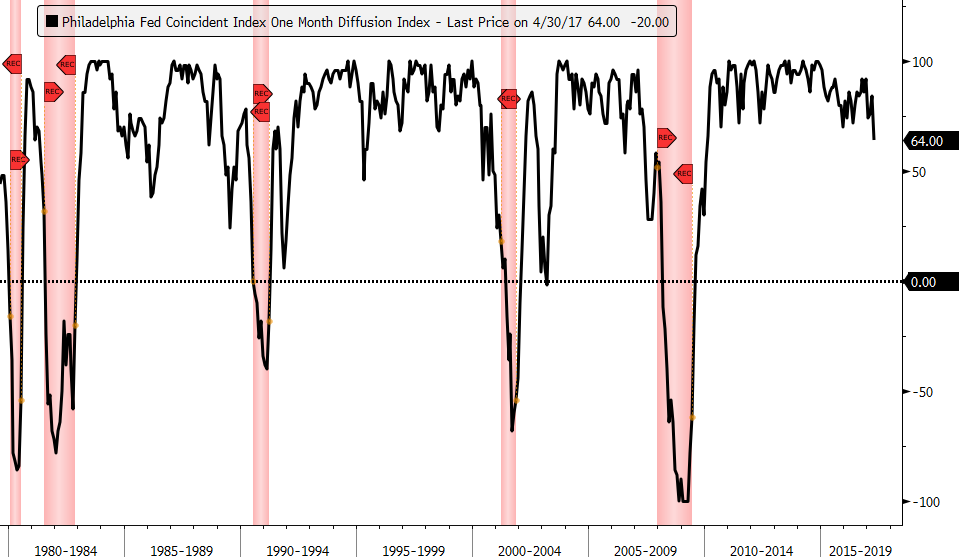
For the US economy, one technique for measuring breadth is to look at the percentage of states expanding. As one should expect, recessions often occur when there are more states contracting than expanding. You can see this by looking at the Philadelphia Fed State Coincident Index where recessions are shown below in red. Economic breadth has weakened but we are still above recessionary-warning levels. If more states continue to weaken, this will be a red flag for the world's largest economy.
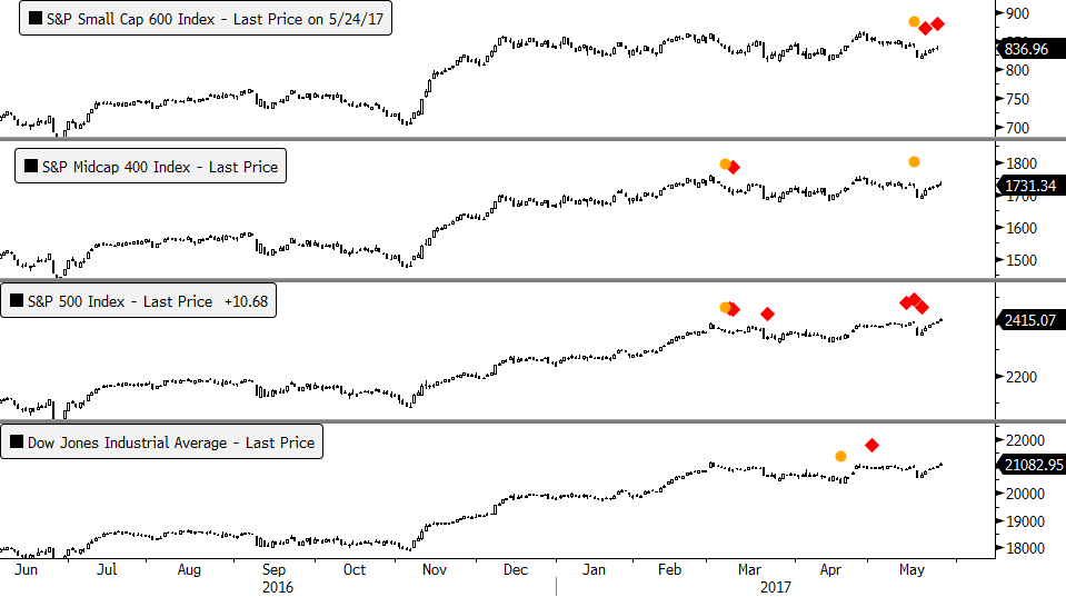
Now, after establishing how important it is to look at market and economic breadth, let's consider the recent string of Hindenburg Omens—an ominous sounding signal for weak breadth. The traditional technique was used on the New York Stock Exchange (NYSE), but, given all of the non-operating securities listed, I apply it instead to the S&P 600 Small Cap, S&P 400 Mid-Cap, S&P 500 Large Cap, and Dow Jones Industrial Average. Hindenburg Omens should not be dismissed lightly given they often occur in clusters near major market tops. Here's the 2000 market top, for example:
Investors would have done well to heed the warnings seen by the host of signals given in the summer and fall of 2000 and in the spring of 2008 when financial talking heads were still arguing that we were not in a recession or bear market.
Even prior to the volatile summer of 2015 or the early 2016 January market swoon we saw numerous signals after barely receiving any from 2012-2014, suggesting that market breadth was deteriorating.
Thus, the current string of omens signaled over the last two months has been concerning and warrants a deeper investigation into what areas of the market the weakness is stemming from.
To do that I looked at the S&P 1500 Super Composite, which encompasses all 1500 members of the combined S&P 400, 500, and 600 indices and also represents nearly 90% of the entire US stock market capitalization. I then measured the percentage of members within each sector that have rising 200-day simple moving averages and sorted them from largest to smallest (2nd to the last column on the right). What we see is that the three top sectors with the strongest readings for its members with long-term rising trends are the financial, technology, and industrial sectors while the telecommunications, energy, and consumer staples sectors round out the bottom.
Given the top three sectors with the strongest long-term breadth readings are cyclical sectors and two of the bottom three sectors are defensive, this sheds some light on how to view the recent Hindenburg Omens. Hindenburg Omens being caused by the cyclical areas of the stock market would be of greater concern since they are more sensitive to the economy and have a much larger influence on the indices.
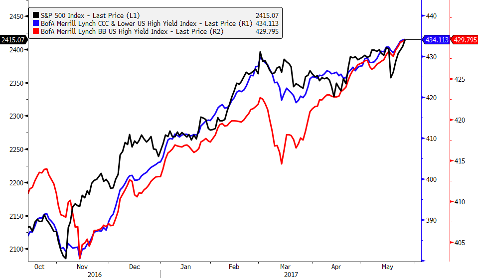
Another reason why weakening breadth readings are not a major cause of concern at present is that the credit markets are showing no signs of fear and are typically the first to throw up the red flag prior to market tops and corrections. As seen below, the BB (red line) and CCC-rated (blue line) junk bond indices are hitting new highs and confirming the bullish tone of the stock market.
One thing I believe investors need to keep an eye on is the 10-Yr UST yield and its impact on the financial sector. The financial sector represents the second largest sector weighting of the market at 17% and the sector’s poor performance year-to-date has weighed on the markets...but that may be about to change. Heading into 2017 everyone was bearish on bonds with the expectations that rates would move up considerably this year with the Fed raising short-term interest rates 3-4 times. Given how one-sided the bet on interest rates was, “Bond King” Jeff Gundlach at DoubleLine Capital believed rates would head lower this year first before heading higher. Sure enough, Jeff was right as the 10-Yr UST yield has fallen since the start of the year.
Shown below is the 10-Yr UST yield shown in the top panel and commercial hedgers' net futures position relative to total open interest for the 10-Yr in the bottom. Commercial hedgers tend to take the opposite position of speculators (AKA: “Dumb money”) and are considered “smart money.” Like Gundlach, commercial hedgers were bullish on bonds (expected rates to fall) and had their most bullish position in bonds since rates peaked in 2014. As seen by the red circles below, when commercial hedgers' net long position reaches elevated levels, bonds tend to rally and rates fall.
Conversely, when their net position is short, bonds tend to fall and interest rates rise, which is shown by the blue arrows. Over the last few weeks, commercial hedging positions have flipped from bullish to bearish while speculator positioning and sentiment is now close to where it was in the middle of 2016 when rates bottomed. What this means is that sentiment is currently no longer a hindrance to higher interest rates.
In order for rates to move higher, however, we'll need to see round two of the global “reflation trade.” Round one was the initial move off the 2016 summer lows but the reflation trade stalled entering 2017. This can be seen by looking at global 10-yr breakeven inflation rates. We may be seeing the early signs that the second stage is getting ready to begin as it appears Japan breakevens (green line) have bottomed as well as European breakevens (blue line) as current levels are above their April lows. What we’ve yet to see is any meaningful turn up in US or UK breakeven rates.
In the Barron’s 2017 Roundtable, Jeff Gundlach mentioned the copper/gold ratio as a good indicator for analyzing the direction of bond yields. In addition to that, the relative performance of interest-rate sensitive stocks, such as the financial to utility sector ratio, is also helpful. These two ratios are plotted below along with the 10-yr UST yield and we’ve yet to see a definitive turn higher in any, which continues to bear watching.
Should we see a move higher in the above measures, that could be enough to spark the global reflation trade where the financial sector stands to be a prime beneficiary. Given the sector’s large weight in the market indices, a move higher in rates and corresponding move in the financial sector may be the next catalyst to send the market higher. Likewise, a move lower in the copper/gold ratio and 10yr UST yield could signal the reflation trade that began in 2016 is officially over and that we are moving into a risk-off, deflationary environment.
Listen to our recent interview with Chris Puplava by clicking here. Not a subscriber? Click here.


