With the equity market rally over the past month our long term and intermediate surveys continued to improve with the long term outlook firmly in the bullish camp (>60%) while the intermediate outlook has recently moved from neutral-bullish to bullish with its push over the 60% threshold.

* Note: For further explanation of the market surveys and background on analysis, please click here.
200 Day Moving Average Evaluation – Long Term Trend Determination
As shown in the table below, the net percentage of stocks that are in long term uptrends increased to 73% while the percentage of stocks in downtrends decreased to 27%. In terms of sectors, the telecom sector takes the top spot as the percentage of its members in uptrends increased to 88% while the utilities sector takes the second spot with its 88% reading. The absolute worst sector remains materials as only 55% of its members are above their 200 day moving averages.
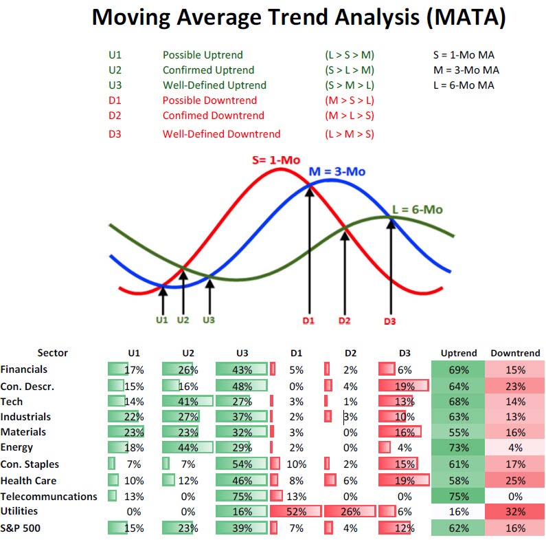
Moving Average Trend Analysis (MATA) – Intermediate Term Trend Determination
We saw a further improvement in the MATA survey for the S&P 500 in which the percentage of stocks in uptrends increased from 56% to 62%. We saw a decrease in the percentage of stocks in intermediate downtrends decreased to 16%.
52-Week Highs and Lows Data
The data for the S&P 500 for 52-week highs and lows shows that the greatest breadth in terms of new highs continues to come from the defensive non-cyclical sectors with consumer staples leading the pack—29% new highs last month—but, more importantly, is the fact that every sector now has new 52-week highs exceeding the percentage of new 52-week lows as market breadth is expanding to the upside as the overall market health continues to improve.
Sector & Asset Class Rotation
Below is the relative rotation graph from Bloomberg that shows both the relative momentum and relative performance of assets versus a benchmark. Numbers north of 100 show improving relative momentum while numbers below show weakening relative momentum to the benchmark, and numbers to the right of 100 show outperforming assets and to the left underperforming assets.
Market Cap Rotation
Over the last few weeks we have seen a rotation from large cap issues (S&P 100: OEX) and into smallcap (S&P 600: SML) and midcap issues (S&P 400: MID) which reflects the markets growing risk appetite. The real improvement over the past few weeks has been seen in the midcap space as its relative momentum (vertical movements in rotation chart below) has seen the biggest jump.
Weekly Market Cap Relative Performance to S&P 500 (09/11/2012)
Source: Bloomberg
Sector Rotation
Over the last few weeks we can see a major shift in relative performance of non-cyclical sectors versus cyclicals sectors (risk-off vs risk-on) with financials showing the greatest improvement as it has moved from weakening momentum and lagging the S&P 500 (lower left quadrant) to lagging but improving (upper left quadrant). The greatest deterioration has been seen in the non-cyclical sectors like health care, consumer staples, utilities, and telecommunication (yellow lines) as they have moved from being market leaders with improving strength (upper right quadrant) to market leaders and weakening strength (lower right quadrant). Early and late-stage cyclicals have shown improvement as they are following in energy’s footsteps as they move from lagging and weakening (lower left quadrant) to lagging and improving (upper left quadrant).
Weekly Sector Relative Performance to S&P 500 (09/12/2012)
Source: Bloomberg
Fixed Income Rotation
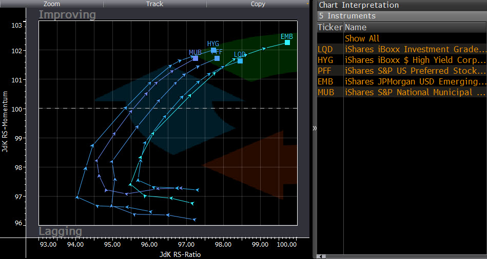
Just as there is a clear rotation to risk assets in market cap performance and sector relative performance, we are seeing the riskier classes within fixed income outperform US Treasuries as high-yield, corporate bonds, preferreds, municipals, and emerging market bond funds are all gaining ground on US Treasuries as investors appetite for risk grows even in the fixed income sector.
Weekly Fixed Income Relative Performance to iShares Barclays 20+ Year T-Bond (09/12/2012)
Source: Bloomberg
Summary
The market’s long-term and intermediate-term trends have both moved to the bullish side of the ledger which is not surprising given the S&P 500 has exceeded its 2012 highs and now rests at levels not seen in four years. In addition to improved overall market breadth, it is encouraging to see that the riskiest areas of the markets are outperforming which is the case in strong bullish moves. A desire for increased risk exposure is clearly visible as cyclical sectors are outperforming as well as small and mid cap stocks, and there is a clear shift towards risk even in the fixed income space. Concerns over a market peak may arise should we start to see weakening breadth as well as a rotation into “risk-off” assets (defensive sectors, large cap, UST), which clearly is not the case at the present time.


