


Knowledge of when to hedge or lighten your portfolio is vital knowledge for investors. With today’s market volatility it is likely the difference between a comfortable retirement or disaster. In this article I am going to start to develop the structure and use of the Long Term Trend Charts (LTTC). I will endeavour to show you how the various time charts fit together and the particular purpose of each. We will look at their application as hedging tools and as trading tools.
For an introduction to the Danielcode LTTCs, see my previous article “The 401(k) Dilemma”, available under the Articles tab in the DC sidebar menu, or in my FSO archives.
Signals:
The LTTCs create 2 different signals:
- The trend indicator signals are created from a proprietary algorithm. You will not be able to see these signals on your own charts.

- The Regression Channel signals. You will be able to create an approximation of these signals on your own charts by using a standard regression analysis tool. There is a specific technique to drawing the regression channels, which you may not be able to emulate exactly. Additionally, the time periods used for the DC LTTCs will vary depending on the start date of the data sets you are using. End dates for the charts vary between markets and are also dependent on holiday schedules for various markets which differ significantly. It would be preferable to have common anniversaries across markets for all of these charts, but an appropriate solution is not readily available.

Time Periods for Charts
The primary purpose of these charts is to identify the dominant trend in various markets. This seems a simple enough proposition, but for some reason, unknown to me, It is a skill much lacking from many investment portfolios. I showed in the “401(k) Dilemma” article that if investors could remove even 40% of market draw downs from their portfolios, then major Equity Indices truly become compounding machines of great power. The purpose of the investors’ charts is to show you in a simple, non technical way, when you should be hedging your portfolio, or taking other measures to isolate your investments from significant down drafts in markets.
And the selection of appropriate charts is time dependant. Indeed there can be no discussion of market trend without the specification of the time period under consideration.
Which period is most suitable for your purpose is entirely dependant on your investment or trading stance. For investors, 401(k) and Funds, the DC “Monthly” chart (24 trading days) will likely be most appropriate. If you want an earlier but still stable signal, you might combine the monthly chart with a 12 day chart, or perhaps a 9 day chart. We have them all.
Those who want and are prepared to take a more active interest in their investments, may opt for the DC “Weekly” chart (6 trading days). It too is remarkably stable, particularly in major Equity markets, as we shall see.
Strategies
I will develop some alternate strategies for you as we progress through this series, but an easy example might be to take the major trend on the monthly chart but use a shorter term chart for stops or risk limits on various percentages of your portfolio. I have clients who will progressively hedge as the signals are created on the 6 day chart (hedge or reduce your exposure by 10%), 12 day chart (40%) etc. The combinations are endless, as are the hedging tools available, and directional trades.
On the 6 day chart, the trend change setup bars offer marvellous entries for both an election and a reversal of the signal. Options are of special benefit to this strategy, as non directional hedges can be established. For futures traders, a smaller time frame needs to be considered due to the leverage. When you get used to seeing these charts you will begin to notice some interesting characteristics, particularly the tendency of markets to retest the outer band of the regression channels once a trend change signal has been made.
The Charts
Where we have the choice, the Index chart is preferred to the Futures chart, which is respectively preferred to a Stock chart. Indices and Futures tend to be precise. Single Stocks are sloppy but improve as the cap increases. The seriously large cap Stocks are amazingly precise. Conceptually, what we are looking at with the regression channels is an “Angle”-Gann’s 4th degree. This has elements of time and price as it combines both axis of standard charts. You don’t need to know this stuff now, but it’s interesting cocktail chatter! Here is a selection of different time period charts for important markets:
S&P- DC Monthly chart-24 trading days.
Prop trend signal is up.
Regression channel signal is up.
Current period bar completes 12/31.
A current period close below 1078 will be a Sell setup bar.

S&P-DC 9 day chart
Prop trend signal is up.
Regression channel signal is up.
Current period bar completes 12/04
A current period close below 1081 will be a Sell setup bar.

S&P-DC 6 day chart
Prop trend signal is up.
Regression channel signal is up.
Current period bar completes 12/07
A current period close below 1083 will be a Sell setup bar.

Gold-DC Monthly Chart-24 trading days
Prop trend signal is up.
Regression channel signal is up.
Current period bar completes 12/02
Markets find it hard to close above the regression channel. Markets that close above the regression channel for 2-3 months on this chart are set for a violent reaction.

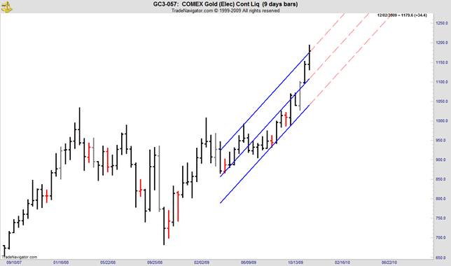
Gold-DC 9 day chart
Prop trend signal is up.
Regression channel signal is up.
Current period bar completes 12/02
Markets find it hard to close above the regression channel. The upper edge of the channel is at 1175. If this market closes on Wednesday above that number, the most likely prospect is a pullback to the centre of the channel, which for the next period will be at 1128.
DX-DC Monthly Chart-24 trading days
Prop trend signal is down.
Regression channel signal is down.
Current period bar completes 12/09.
The DC black line, the last level of Danielcode support for this chart is at 73.105. A monthly close below the black line suggests new lows will follow shortly.

DX-DC 6 day chart
Prop trend signal is down.
Regression channel signal is down.
Current period bar completes 12/04.
Last week this market found support at the DC Blue line target at 74.15. A close on Friday above 75.50 will be a Buy setup bar on this chart time period.

The proper drawing of the regression channels, is like a TV show that my children ridicule, featuring a pretty girl with a vacuous look; "It's complicated".
I try to simplify this stuff for you guys and gals, but it's really not simple. All markets have their own "vibration", what WD Gann called the "Law of Vibrations". So each market has an identifiable signature or vibration. Gann, who was much dependant on Sepharial for his market insights, thought that vibration came from each market's birth number ie its horoscope. In Sepharial's "Silver Key" he shows a horoscope of the “birth” date and time of the New York Stock Exchange and the first trade of a number of stocks on that exchange. He ascribes the NYSE signature vibration to those calculations.
Of course, most of that is nonsense and the true number or vibration for NYSE is the sum of its parts. If you run a best fit regression for every stock on NYSE and give them an exponential weighting, then take the mean of that rating, you will have the true vibration of NYSE.

Strangely it is not far from what Sepharial calculated 90 years ago with his birth charts!
So, each market has its own unique vibration and the settings on the regression tool vary accordingly. Most of this stuff is science, but some is art.
Which chart and its use is particular to each trader. A long term investor will use the DC "Monthly" charts, with perhaps the 12 or 9 period chart signals as stops. A swing trader will be interested in the 6 day charts. There are limitless variations on this theme. And of course a setup bar that is not elected gives great entries for reversals which have a 90% plus probability of running to the centre line and about 78% probability of going to the other extreme of the regression channel.
Just get used to looking at these charts. After a few hundred charts, the lights will go on (that's for me, but likely far fewer for you). You will see all sorts of trading opportunities and possible strategies.
Certainty
I personally find the long term charts fascinating. And here's the best part; In this era of the 24/7 news cycle and overcapacity in most media outlets, we are continually bombarded with masses of economic and fundamental advice on markets, all in the hope of divining future market direction. And for every learned economist with a big name and a take on markets, there is always another who has formed a diametrically opposed view from the same data. That's why there are so many economists. As the data they rely on is always imperfect, so is their interpretation, though in truth personal bias plays a big part in these divinations.
By relying on the LTTCs we can escape all that nonsense. You can even stop reading the financial press if you wish, although it is still the best source of comedy available, even if Tiger has upstaged all this week! Markets cannot make a turn without showing it on the charts, so if the trend is up, just take buys or stay long until the Sell signal is given. Certainty in investing is an undoubted bonus. The long term trend charts bring certainty and clarity to your investment plans. And you will sleep better at nights!
In addition there is a huge part of this business where people and groups like to frighten you. Some are greatly respected and may even believe their doomsday scenarios. But apparently, that's what sells so they keep churning it out and mugs keep buying it. I have any number of students come to me and say that they just can't be long the Equity (or other) market, ever, because the guru de jour says they are going to crash. Small “g” gurus always say they are going to crash. That's their business. The reality is that Equities at least are engineered to rise, and government policy always supports that aim for both policy and fiscal reasons. Bull markets are the dominant theme of Equities and the upward bias prevails better than 77% of the time. So get used to being long and treat bear downdrafts as a welcome opportunity to get a break on the mindless “buy and hold” mob. Understanding how to play the short side of markets is a valuable tool. Markets indeed go up by the stairs and down in the escalator. Bear markets are usually fast and furious, but immensely rewarding to those who know how. If you either don’t know, or don’t want to know Bear strategies, then at least you need to know when to get out of the way. These articles will show you when you need to make those decisions.
Remember that reducing your position is a form of hedging and being flat is a valid position if you don’t have the stomach or propensity to trade both ways. Better still, take some time to learn how to trade long and short. You will be well rewarded.
All of these trend charts are relatively slow, but they are slow by design. That’s what keeps you in the trend for the long haul, Jesse Livermore’s favourite trade. Review the "401(k) Dilemma" article again. The DC trend signals were correct for 97% of the 15 years we looked at with this technique, and that can be improved with a simple stop loss strategy.
Getting Faster
For those who like their action faster and closer to the bone, we can take this technique down to 3 day charts, provided we know the correct vibration for each market. That’s really trading as opposed to investing, but a most interesting chart that I spend a lot of time on is the 6 day chart. Let’s look at the S&P, as this is a market that I have analysed at length for you, both in the 1st degree (Price) and the 2nd degree (Time), and for which you likely know the prime vibration. The 4th degree is an angle, and regression channel analysis fits nicely into that category, and has the advantage of being much more flexible than the linear ratios that WD Gann used for his Stock analysis.
On this particular time cycle, we can see nicely how the 2 Sell setup bars since March 2009 low which were not elected, gave great entries for mid-term and swing traders. We can also see that from the 2007 top to the 2009 low, there was only a single whipsaw. Impressive stuff for a relatively short time cycle chart. Note how late the Buy signal after the March low, came. A far cry from the Danielcode time and price signals that called that low in public, in advance and accurate to a few ticks (see “The Number of the Beast” in FSO archives)
I have left the first channel and its extension from the 2007 top on the chart, just to show you what caused the 5 week reaction from June 9 to July 14 2009. This detail is likely only of interest to true chart groupies, but for thinkers, the least implication is that charts have memory.

If we can ascribe a form of memory, or at least spatial recognition to regression analysis, then likely there is much more to be learned from these “angles”. In the following chart we create a second channel, which I caution you is only useful if you know the correct vibration for each market under consideration, and we now find that we are nicely defining the outer limits of a trending market. This has some nice implications for us, in our stop loss management.

Stock Selection
Most of the literature maintains that outperforming the market over a long time period, simply on the basis of superior stock selection, is a futile cause, and that has been a view largely adopted by the Funds industry, and hence the rise of popularity in index linked Funds. Whilst this view is not strictly correct, the time and effort to follow a course of superior stock selection that will outperform the broad market, is too onerous for commercial Funds and is adopted by only the driven few. Whilst I wish to adopt the “can’t beat the index” argument for the purpose of this article, as I think it does apply to the vast majority of investors, the proper use of regression analysis on a market sector (not single stock) basis, will result in significant outperformance vis-à-vis the index.
So to simplify your stock selections, stick quite closely to the index. That has the added advantage of allowing you to use index based tools for your hedging strategies. Knowing when to hedge, or when the preponderance of risk makes hedging cost effective is the key. And the techniques I am espousing here will give you that knowledge with a degree of certainty. There are endless hedging strategies available with the proliferation of simple unidirectional ETFs, options and other tools. And your broker or adviser will know of them. Start by ensuring that your account is set up in such a way that access to hedging tools is possible in a convenient and timely manner. Securities regulations both in US and elsewhere tend to see stock or share accounts as separate entities, and it is likely that you cannot use that account to access a hedging strategy. Talk to your broker about these options while there is still time. When the need to hedge your portfolio happens again, you will need to act promptly, not begin thinking about it.
Get out in front of the crowd now.
I invite you to visit the Danielcode where there is much material on trading and trade strategies. We are currently developing the production and distribution of a selection of long term charts in the more common and important markets, and have found a high level of interest. I trust this article takes you a step further in your appreciation of these tools and techniques. Lack of knowledge has adverse consequences. It has since time immemorial.
Isa 5:12 And the harp, and the viol, the tabret, and pipe, and wine, are in their feasts: but they regard not the work of the LORD, neither consider the operation of his hands.
Isa 5:13 Therefore my people are gone into captivity, because they have no knowledge:
Copyright © 2009 John Needham


