Debt, the debt ceiling, the federal budget and inflation seem to be gathering much attention in the media. The following charts review each of these areas.
Chart 1
The following chart plots the amount of gross federal debt each and every month from December, 1924. A least squared trend line of the entire period shows debt is rising at a compound annual rate of 7.8%.

Chart 2
Gross Federal Debt as a % of 4Q 2010 Nominal GDP at the end of March was 95.96%.
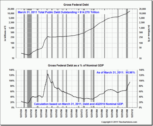
Chart 3
Congress last raised the debt ceiling to .3 trillion in February, 2010. As recently as August, 1997, the ceiling was less than trillion.

Chart 4
The federal government employs many accounting gimmicks when reporting receipts and expenditures. Perhaps the purest way of knowing what the rolling annual federal deficit is might be to compare the amount of debt at the end of a month to the amount of debt at the end of the month one year ago. The following chart does just that. Only 15 1/2% of all months since 1924 show a surplus. In other words, the ruling, political class have employed deficit financing for quite some time. It might prove very difficult to find the political will to voluntarily remove this “addiction to borrow and spend” from the expectations of the public.

Chart 5
The top panel of this chart shows receipts and expenditures of the federal government since December, 1981. The bottom panel shows the surplus or deficit on a monthly basis. The data comes from the Monthly U.S. Treasury Statement and includes the accounting gimmicks mentioned above. It shows a period of surpluses from 1998 to early 2002.

Chart 6
This chart reveals that the March, 2011 deficit amounts to 9.46% of December, 2010 Nominal GDP.

Chart 7
This chart show both the Surplus/Deficit calculated from the U.S. Treasury numbers and our alternative method of calculating the Surplus/Deficit.

Chart 8
We are now going to review the latest inflation numbers reported for Producer Prices (PPI) and Consumer Prices (CPI) released last week by the Bureau of Labor Statistics. We start with a chart of the three main categories of the PPI: finished goods, intermediate goods and crude materials. Finished goods is the headline number that the media focuses on each month. Notice that all three measures are advancing at annual rates above 5%.

Chart 9
This chart shows the Finished goods index from the peak of every business cycle in the post World War II period. We rebase the index to 100 on the peak month of the expansion. The dates represent the year of the business cycle peak.
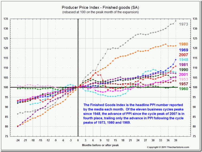
Chart 10
This chart shows a composite of 10 business cycle peaks prior to the most recent one and is overlaid with the most recent cycle peak that occurred in 2007.

Chart 11
This chart shows both the All items and the “core rate” for the Consumer Price Index. We also show a listing of the annual rates of change for the eight major sub categories of CPI.

Chart 12
This chart shows the Consumer Price Index- All items index from the peak of every business cycle in the post World War II period. We rebase the index to 100 on the peak month of the expansion. The dates represent the year of the business cycle peak.
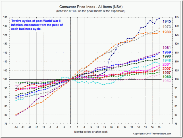
Chart 13
This chart shows a composite of 11 business cycle peaks prior to the most recent one and is overlaid with the most recent cycle peak that occurred in 2007. Yes, this cycle is lagging behind the composite cycle. However, it has turned up strongly in the last three months and the March, 2011 annual rate of 2.7% is higher than the 2% number often stated by the Fed as its unofficial target for inflation.

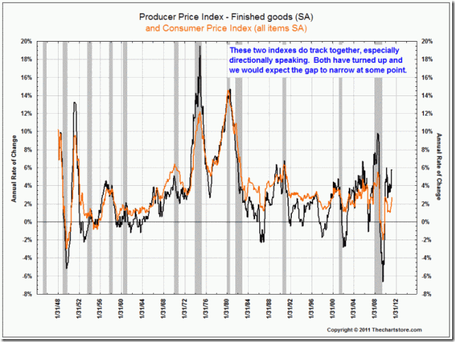
Chart 14
This chart compares the Producer Price Index- Finished goods with the Consumer Price Index – All items.