Every now and then, we just like to look at charts that compare various assets to each other by simply dividing the price of one by the price of the other. For this article, we chose Gold and divided it by nine other assets. The prices used are closing prices on Friday and cover the time period from 1970 to October 29, 2010.
Chart 1
The Gold/Silver Ratio has been a standard for years and years. Silver has outperformed gold since March, 2010.

Chart 2
The Gold/Crude Oil Ratio has had numerous volatile swings, the most recent one involving the mid-year 2008 peak in Crude Oil prices.

Chart 3
The Gold/Aluminum Ratio peaked in February, 2009. Gold outperformed Aluminum from early 2001 until that peak.
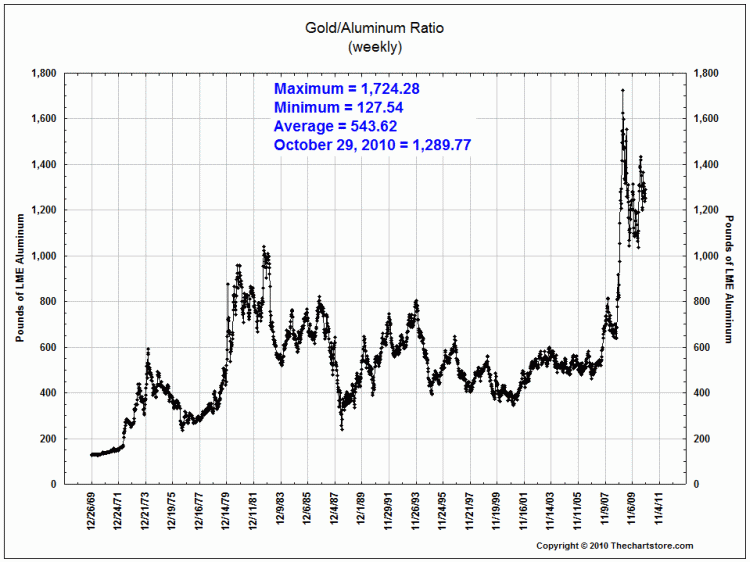
Chart 4
As can be seen in Gold/Copper Ratio chart below, Gold has had two periods where it substantially outperformed Copper. Those two time periods were August, 1976 to January, 1980 and again from May, 2006 to February, 2009.

Chart 5
The Gold/Corn Ratio chart shows Corn is currently playing catch-up to Gold since late June, 2010. For the two years prior to that, Gold had run to its highest relative valuation versus Corn over the 40 years covered by this chart.

Chart 6
The Gold/Soybeans Ratio says that, on balance, Gold has been a better place to be than Soybeans since May, 2004. The other period of substantial outperformance was from May, 1977 to January, 1980.

Chart 7
The Gold/Wheat Ratio chart is showing that Wheat has been doing better than gold on a relative basis since October, 2009. This latest move comes after Gold had spiked to its highest relative level over the 40 years covered by this chart.

Chart 8
After a huge outperformance by Gold beginning in late 2000, the Gold/Cotton Ratio shows Cotton has made a dramatic move versus Gold since March, 2010.

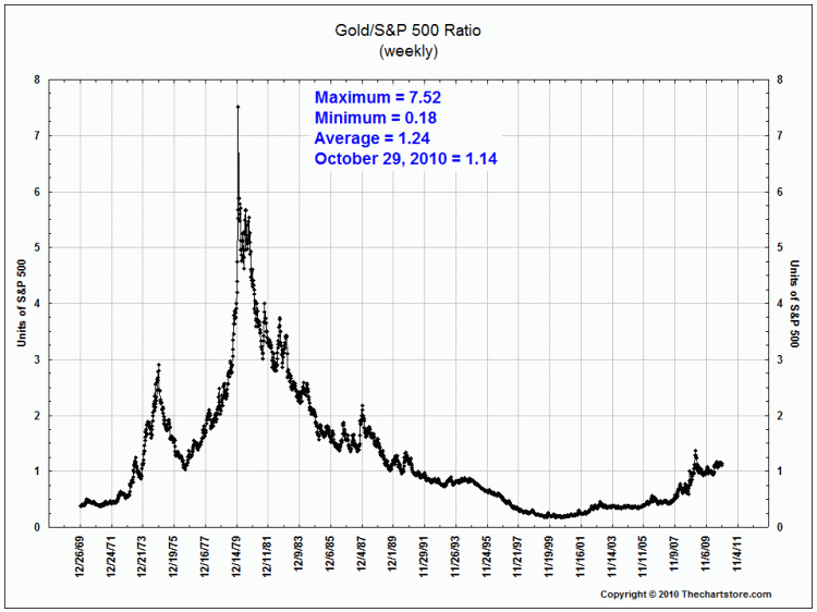
Chart 9
The Gold/S&P 500 Ratio compares a HARD asset against a FINANCIAL asset. Gold won from 1970 to 1980, the S&P won from 1980 until July, 1999 and Gold has been winning since.