The following is an excerpt from our monthly Macro Intelligence Report (MIR).
The month of September is shaping up to be an eventful one for markets.
Here’s a snapshot of what will dominate price action and news flow over the next 30 days.
- North Korea’s sixth nuclear test and the world’s response
- Damage assessment and rebuilding following Hurricane Harvey and now Hurricane Irma
- FOMC meeting and the possible start of its balance sheet reduction (aka. Quantitative Tightening)
- Raising the debt ceiling (note: this was kicked to December as this article went to press)
- The normalization of the Treasury’s cash balances
Some of these events pose higher risks than others. Some of them are more probable than others. All of them increase market uncertainty and will, therefore, affect price action in one way or another.
Markets move in cycles of varying types and time scales. Low volatility regimes lead to excessive risk taking and crowded positioning which leads to instability and high volatility regimes and on and on.
The VIX (volatility index) recently had its 4th lowest monthly close in history. 5 out of the 10 all-time lowest VIX closes have occurred in 2017. The S&P hasn’t had a down month since October, the longest bullish streak in over 20 years.
Low volatility by itself is not cause for alarm or reason to sell down longs. But it’s important context when looking at upcoming market events and adjusting one’s risk exposure.
Despite the overhang of these seemingly bearish events, we argue that these are more distraction than market moving. The really important variable is in the economic phase shift we’re experiencing and its bullish impulse for markets which we’ll soon discuss.
In this article, we’re going to introduce the concept of the “Investment Clock”.
Using this model we’ll show how higher growth and higher inflation are set to drive markets into the end of the year.
The “Investment Clock”
We use a number of mental models to better understand markets and the world. We’ve shared many of these models; such as Debt Cycle theory, the Capital and Kuhn “Soros” cycle, and the Five Sentiment Stages of a bull market, amongst others, and today we’re going to share another valuable mental model we use, called the “Investment Clock”.
We were first introduced to the idea in a research paper put out by Merrill Lynch.
It’s a simple yet useful framework for understanding the various stages of a business cycle and which asset classes perform best in each stage. A similar framework is used at Bridgewater Associates, one of the most successful hedge funds of all time.
We’ll walk through the concept and then apply it to the current market to see which assets are likely to perform best going forward.
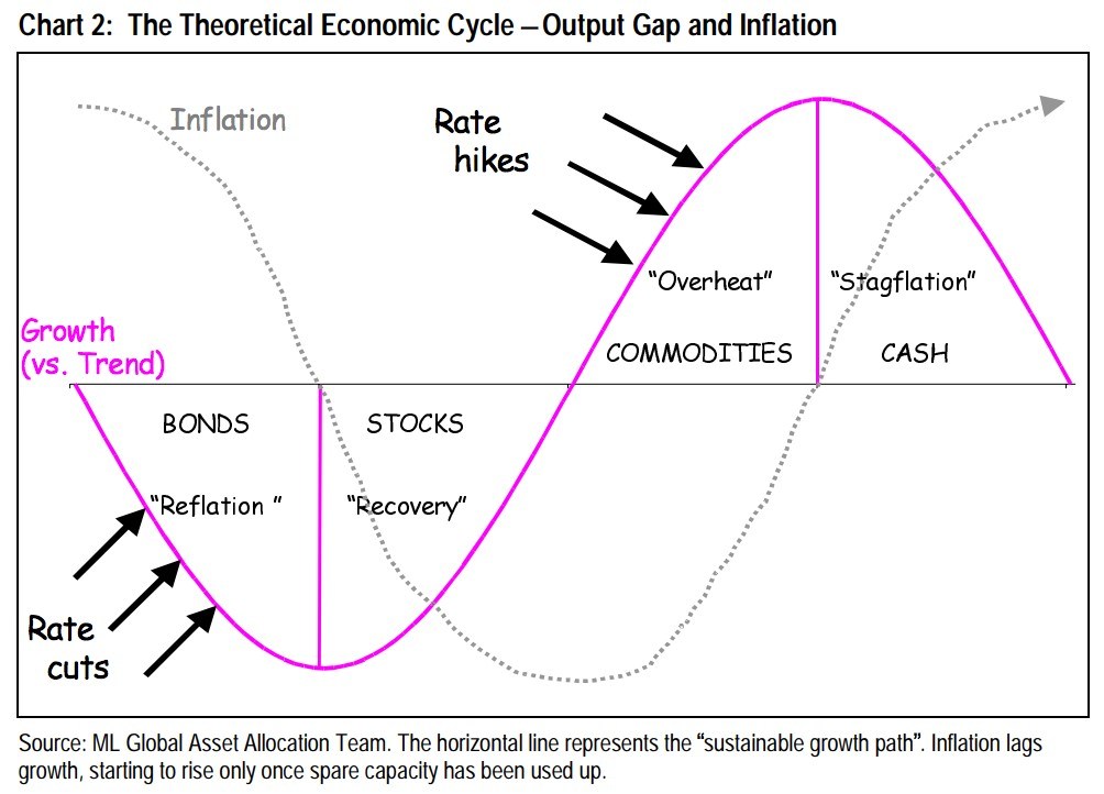
The Investment Clock splits the business cycle into four phases. Each phase is comprised of the direction of growth and inflation relative to their trends. You can see these four phases in the chart below via Merrill Lynch.
Here’s a breakdown of each phase.
Phase 1 – Reflation phase: Growth is sluggish and inflation is low. This phase occurs during the heart of a bear market. The economy is plagued by excess capacity and falling demand. This keeps commodity prices low and pulls down inflation. The yield curve steepens as the central bank lowers short-term rates in an attempt to stimulate growth and inflation. Bonds are the best asset class in this phase.
Phase 2 – Recovery phase: The central bank’s easing takes effect and begins driving growth to above the trend rate. Though growth picks up, inflation remains low because there’s still excess capacity. Rising growth and low inflation is the goldilocks phase of every cycle. Stocks are the best asset class in this phase.
Phase 3 – Overheat phase: Productivity growth slows and the GDP gap closes causing the economy to bump up against supply constraints. This causes inflation to rise. Rising inflation spurs the central bank to hikes rates. As a result, the yield curve begins flattening. With high growth and high inflation stocks still perform but not as well as in phase 2. Volatility returns as bond yields rise and stocks compete with higher yields for capital flows. In this phase, commodities are the best asset class.
Phase 4 – Stagflation phase: GDP growth slows but inflation remains high (sidenote: most bear markets are preceded by a 100%+ increase in the price of oil which drives inflation up and causes central banks to tighten). Productivity dives and a wage-price spiral develops as companies raise prices to protect compressing margins. This goes on until there’s a sharp rise in unemployment which breaks the cycle. Central banks keep rates high until they reign in inflation. This causes the yield curve to invert. During this phase, cash is the best asset.
Below is a chart that illustrates this process.
The investment clock helps with understanding the progression of the economic cycle. As well as help you think about preferable asset allocation for each relative phase.
Here’s the following from Merrill Lynch:
- Cyclicality: When growth is accelerating (North), Stocks and Commodities do well. Cyclical sectors like Tech or Steel out-perform. When growth is slowing (South), Bonds, Cash and defensives outperform.
- Duration: When inflation is falling (West), discount rates drop and financial assets do well. Investors pay up for long duration Growth stocks. When inflation is rising (East), real assets like Commodities and Cash do best. Pricing power is plentiful and short-duration Value stocks outperform.
- Interest Rate-Sensitives: Banks and Consumer Discretionary stocks are interest-rate sensitive “early cycle” performers, doing best in Reflation and Recovery when central banks are easing and growth is starting to recover.
- Asset Plays: Some sectors are linked to the performance of an underlying asset. Insurance stocks and Investment Banks are often bond or equity price sensitive, doing well in the Reflation or Recovery phases. Mining stocks are metal price-sensitive, doing well during an Overheat.
Pretty simple, right?
Now let’s apply this framework to where we are today.
A good place to start is by looking at the GDP gap. GDP or “output gap”, measures the difference between the economy’s actual GDP and its potential, when producing at full capacity.
The zero line represents full economic capacity or a closed GDP gap. When the reading is positive (above the zero line), it means the economy is producing at above trend capacity. This causes inflation to rise and drives the central bank to hike rates. This is why a recession (marked by the vertical grey bands) follows after each subsequent period of above capacity production.
Some guesswork goes into figuring out what the economy’s potential GDP is — and actual GDP, for that matter — but we don’t need exactness. We’re just concerned with the bigger picture. And looking at the chart, it’s reasonable to say that the economy is operating near full capacity, but not yet above it.
This means we’re in the later phases of the cycle but not at the end.
A look at GDP shows that growth remains firm and is trending up.
So we have one part of our equation. We know that growth is trending up and GDP gap is tight but not yet above capacity.
Now we have to figure out the other variable; inflation.
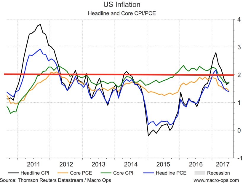
Inflation peaked earlier in the year and has since turned down below the Fed’s 2% target. Depending on the measure, inflation is currently between 1.4 and 1.7%.
We’re less concerned with the absolute value as we are with the trend and where it’s headed.
One tool we can use for that is capacity utilization.
Capacity utilization is another way to measure GDP gap. It’s useful because when the economy is firing on all cylinders it causes what’s called “demand-pull” inflation where demand exceeds supply which causes prices to rise.
The chart below shows the relationship. Both capacity utilization and CPI are smoothed over 12 months to shake out the noise. Capacity utilization leads inflation by 6-12 months.
As the business cycle advances, capacity utilization will continue to rise, pulling inflation up with it.
But inflation is a tricky ephemeral thing so it pays to look at a number of indicators to get a better idea of what’s going on.
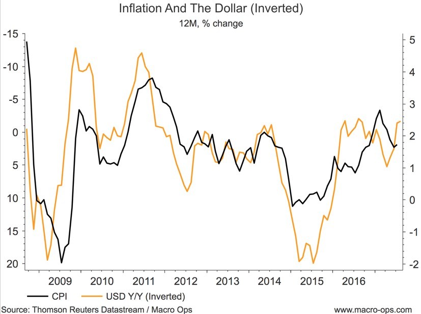
One of the best leading indicators of inflation is the relative change in the dollar. This is because the dollar is the world’s reserve currency. Most international trade is done in dollars. And commodities are priced in dollars.
When the US dollar falls it pushes commodities up. It also makes imports more expensive. Both of which drive inflation.
A great way to figure out where inflation is headed is by paying attention to where the dollar has been.
When you run a regression analysis, you’ll find that inflation and the dollar have a correlated relationship. Movements in inflation lag the greenback by two months on average.
You can see on the chart below we are due for a pop in inflation on the back of recent dollar weakness.
Capacity and the dollar are the largest drivers of inflation outside of extreme supply shocks such as the 73’ oil embargo. But we can always look at the wage data which is a lesser, though still important, data set for gaming inflation.
Labor is the largest input into production. Wages tend to be sticky but in the later stages of the cycle, the labor market tightens which drives up labor costs, as employers compete for scarce workers.
Recent wage growth has been disappointing but the data suggests that pressures are building under the surface which should lead to a pickup in wage growth very soon.
THe NFIB survey (NFIB is America’s largest small business association) indicates that the rising cost of labor is now, by far, the number one concern of owner/operators.
And the Conference Board’s jobs balance indicator has been trending higher too telling us jobs are becoming increasingly easier to get.
So now we have our second input in the Investment Clock. The economy is nearing full capacity and growth is trending up. Inflationary pressures are building which will pull inflation higher in the months ahead.
Positive Growth and Positive Inflation Put Us in Phase 3 of the Cycle
“The Overheat phase”
To repeat, the overheat phase is where GDP gap closes (which is happening) and the economy bumps up against capacity, causing inflation to rise.
The central bank hikes interest rates and bonds selloff causing the yield curve to flatten (also happening). With high growth and high inflation, stocks still perform but not as well as in phase 2. Volatility increases as higher yielding bonds compete with stocks for capital flows.
In this phase, commodities are the best performing asset class and things like basic materials and industrial tend to also do well.
Take a look at the following chart showing commodities relative to stocks.
Commodities relative to stocks are at their lowest levels last seen in 2000. Which also happened to be right before the start of a major bull market in commodities.
As we progress towards phase 4, inflation will continue to pick up and commodities and commodity related stocks should begin outperforming the broader stock market.
This is what we’ll be focusing on in research pieces we’ll put out in the weeks ahead. We’ll be exploring commodity related plays that will benefit in a high growth, high inflation market — think miners, select emerging markets, agriculture and so on.
Conversely, the bond market will hit a rough patch as rates adjust up to the new inflationary environment.
And as this article goes to press, there’s been a number of developments that could have far reaching impacts on the market.
Stanley Fischer, the Fed’s Vice Chair, abruptly announced that he’ll be stepping down immediately. He’s one of Yellen’s closest associates and has helped balance out the more dovish voices in the FOMC.
President Trump now has three empty Fed chairs to fill. And he’s made his desire for a lower US dollar very clear through multiple twitter declarations. So it’s unlikely he’s going to install a hard money conservative into any of these slots.
Dovish dissent has been growing in recent months among FOMC members, from vocal members such as Kashkari and Brainard.
There’s the increasing possibility that the Fed board becomes overweight with policy doves. If so, this will have enormous policy implications for the market and especially the dollar.
It’d also make the bullish case for commodities that more convincing.
Summary:
- The Investment Clock consists of four phases (Reflation, Recovery, Overheat, Stagflation)
- These phases are comprised of the trend rate direction in GDP and inflation
- The data currently points to an economy operating near full capacity with higher growth on the horizon
- It also suggests inflation will soon pick up due to capacity constraints, a weak dollar, and signs of coming wage inflation
- This puts us in stage 3 of the Investment Clock, the “Overheat” phase
- Commodities are the best asset class in this phase
- Commodities are historically very cheap relative to stocks
To learn more about our investment strategy at Macro Ops, check our Trading Handbook here.


