Those that follow my personal account on Twitter will be familiar with my weekly S&P 500 #ChartStorm in which I pick out 10 charts on the S&P 500 to tweet. Typically I'll pick a couple of themes and hammer them home with the charts, but sometimes it's just a selection of charts that will add to your perspective and help inform your own view - whether it's bearish, bullish, or something else!
Interview Callum Thomas: Building Case for New Bull Market in Commodities
The purpose of this note is to add some extra context beyond the 140 characters of Twitter. It's worth noting that the aim of the #ChartStorm isn't necessarily to arrive at a certain view but to highlight charts and themes worth paying attention to.
So here's the another S&P 500 #ChartStorm write-up!
1. 50-day moving average breadth: First up is a look at market breadth. The key observation I have on this one is that the market has broken out to new highs, yet we continue to see "bearish divergence" i.e. higher highs on price but lower highs on 50dma breadth. As noted previously, this type of divergence can resolve peacefully - if breadth moves higher to confirm the upward move, but until then it's still a reason to have some level of skepticism on the outlook.
Bottom line: 50dma breadth is still showing divergence and is yet to confirm the breakout in price.
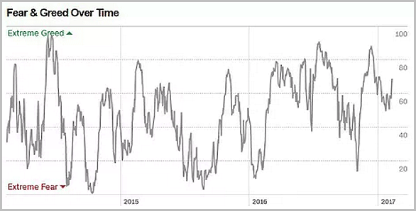
2. The Fear & Greed Index: Next one shows the CNN Money Fear and Greed Index - which provides a composite view of market sentiment. The insight on this chart is that the indicator has turned up after finding a base at the lower end of the recent range. To me this is actually something that would be consistent or confirming of a move higher (in slight contrast to the previous chart and observations), perhaps a prelude or preview of a "blow-off-top".
Bottom line: Sentiment is rebounding off the lower end of the range as part of a potential blow-off-top.
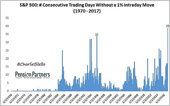
3. Number of consecutive trading days without a 1% intraday move: This peculiar chart from Charlie Bilello shows what the title says - but the main point is that it shows an unusually high level of low volatility... think that through for a second, and then progress to the next chart.
Bottom line: There has been a spike in the number of consecutive trading days without a 1% intraday move.
4. An alternative view of volatility: This graph tracks the rolling 12 month sum of daily moves exceeding positive or negative x% (4 different brackets). It offers an alternative view of volatility and shows changes in volatility regimes across time. The dark blue line (moves exceeding 5% to the upside or downside) rises in only the most volatile of times e.g. 2008 and 1987. Whereas the rest of the lines move to a greater or lesser extent depending on the scale of volatility. The key takeaway from this chart is that after seeing a surge across all but the dark blue line in 2015/16, these measures of volatility have calmed right back down to previous lows - and an important observation is this: "low volatility is often a good predictor of future higher volatility".
Bottom line: Another alternative view of volatility shows a transition back to a low volatility regime.
5. Realized correlation: Very much a related chart, and one that potentially argues for higher volatility, this chart by PIMCO shows rolling realized correlations for the top stocks of the S&P500. A markets rule of thumb is that in times of crises or when macro currents are ruling the state of play vs individual company and sector fundamentals, correlations go towards 1 (e.g. look back to 2008 where correlations converged big time). So it makes a degree of sense that low correlations go with low volatility and high correlations go with high volatility. Interestingly, from the very limited history in that chart it looks like periods of low correlations tend to precede rises in the VIX - something to keep in mind given the previous two charts, and the next graph!
Bottom line: Realized correlations have fallen for the top S&P500 stocks.
6. Expectations vs reality for the VIX: This chart shows the equity sentiment poll from my Twitter account with the net-bulls spread inverted against the VIX. It appears to show that respondents implicitly expect a rise in the VIX, but so far this divergence has yet to close. I talked about this and a few proprietary models I run in more detail in the latest edition of the Weekly Macro Themes and the implications for the VIX outlook. In short, the chart is another clue, along with the previous two that we could be in for higher VIX readings ahead. But then again, it could be that the poll respondents are simply too bearish. Look out for this week's poll reading to see if we get some convergence from the top down with the red line.
Bottom line: The weekly equity sentiment poll shows investors implicitly expect a higher VIX.
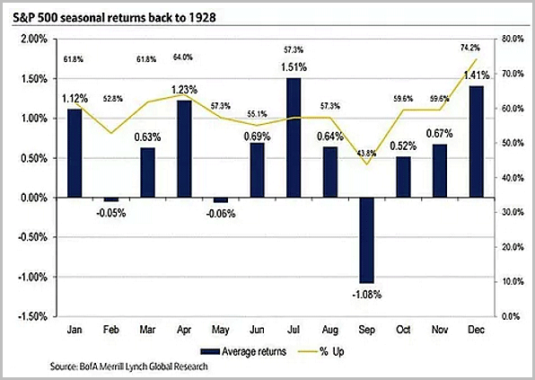
7. Seasonality part 1: The best one line summary for this chart is that historically speaking, February is not well known for its good market performance (relatively low returns and relatively low proportion of positive observations). So while the chart shows much better prospects in March and April, February is usually less impressive.
Bottom line: February is historically one of the worst months of the year for stock market performance.
8. Post-election year seasonality: So we now know that February is usually not that great a month for the market, and well, it doesn't get any better for a post-election year. historically February has been the worst month in a post-election year. There is some intuitive sense to this e.g. any hype around the new president would likely start to wear off at around this point as the reality of the hard job ahead sets in.
Bottom line: Seasonally speaking February is the worst month of the year in a post-election year.
9. An alternative view on valuation: This graph from Hussman shows an interesting lens on valuation for the S&P500. It shows the median price to revenue ratio across the companies that make up the index. Many have been beating the bear drums with this chart, but there's a couple of things I would point out. First, there is a matter of sector representation changes across time (which may have distorted the reading somewhat), then there is the matter of profit margins - the sector issue applies to this one, but so does the structural and cyclical upward shift in profit margins. It also ignores any possible improvement from tax cuts if and when and how they may come under the Trump administration. But the other point I wanted to note is that if you looked at this chart in the mid-late 90's comparing to the late 80's and early 90's you might be alarmed and might conclude the market is overvalued - only to notice the indicator undertook a structural shift to a new plateau (reflecting some of those factors I mentioned). All those caveats said, the indicator is particularly high and warrants noting.
Bottom line: While a couple of caveats should apply, this alternative view of valuation is registering extreme levels.
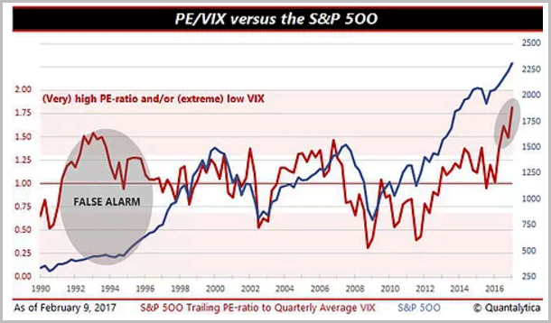
10. PE ratio vs the VIX - a market crash indicator: The final graph in this week's edition shows an interesting indicator which compares valuation to the VIX. The thinking is when you get high valuations and low VIX (a high reading on this indicator) the risk of a market crash is elevated. Whereas a high VIX and low valuation are more consistent with a market bottom. So at present, the indicator is sounding the warning alarm. I would point out that the PE ratio on this is trailing PE - and thus distorted to the upside due to the brief earnings recession that the S&P500 experienced last year and that has since passed. The VIX side of things is valid, though. So time will tell if it's another "false alarm", but there is some value in looking at an indicator like this when you have various other bearish signals starting to hum.
Bottom line: The PE vs VIX indicator is showing warning signs for the stock market.
So where does all this leave us?
This week there's probably 4 categories of interest:
1. Melt-up
The first two charts appear to show the potential starting phase of a "melt-up" or "blow-off-top" with the sentiment measure rebounding from the lower end of the range and the breadth indicator (while showing bearish divergence for now) also rebounding.
2. (Low) volatility
A couple of alternative volatility indicators show particularly low volatility, the problem with this is that low volatility doesn't last - just like high volatility doesn't last. So as indicated in the sentiment poll chart, we could see higher volatility ahead.
3. Seasonality
The normal seasonal pattern is that February is one of the worst months of the year. In a post-election year, it get's upgraded to *the* worst month of the year.
4. Valuation
Two alternative views of valuation (median price to sales, and trailing PE vs VIX) are sounding warning signs for the S&P500 - as noted caveats apply on both fronts, but there does seem to be a weight of bearish evidence building.
Summary
This week the weight of the charts fell bearish - at least on my interpretation (albeit you could take the first two charts, dismiss the last four charts, and embrace the low volatility and bull-on). There is some conflict on time frame e.g. the seasonality aspect says short-term bearish (February), while the low volatility charts could be imminent or months away, and the longer term warning sign charts can sound the warning for a long time. So at this point a few choices come to mind: either go with the flow (the trend is your friend), or pull the horns in, or indeed, go with the flow with tight stops and/or some option protection - and as the VIX shows, option pricing is lower than usual, so that's one bonus of a low volatility environment!
See also: Weekly S&P500 #ChartStorm - 29 Jan 2017


