


A few weeks back I penned a discussion regarding a number of noticeable technical divergences we’re seeing the in current market environment. How these resolve will be important over the short term. Now that the debt ceiling decision has been forestalled, the markets are basking in the knowledge tapering is clearly off the table for the foreseeable future. Very expedient political decision making in front of the 2014 mid-term elections, I must say. How much further will the markets run on the discounting of no tapering, or is this now in price? In this discussion I want to look at a number of chart patterns whose resolution will perhaps be very important from an intermediate and longer term standpoint. And it just so happens these patterns are singing in multi-part harmony exactly as the markets are now assured of no tapering any time soon. Quite the interesting juncture between sentiment and price.
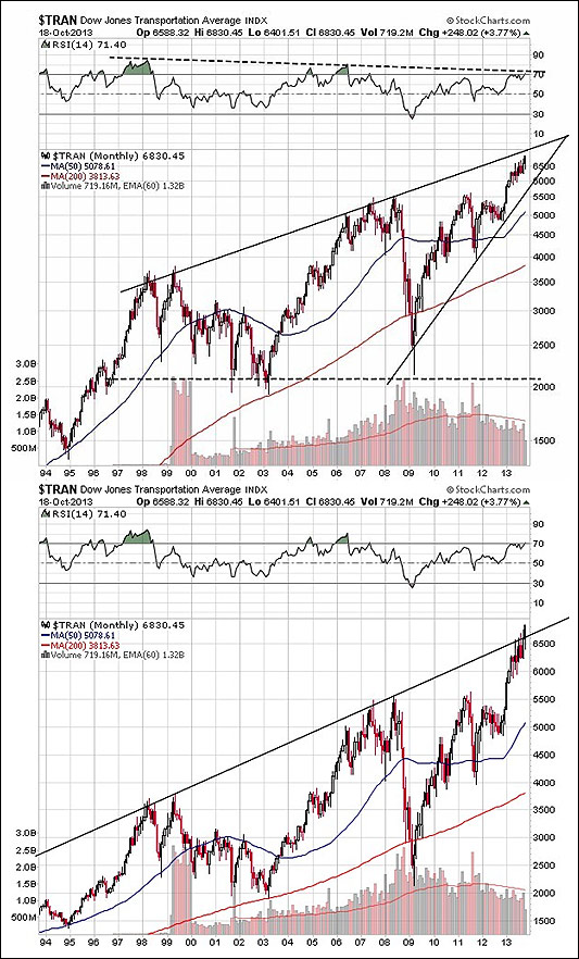
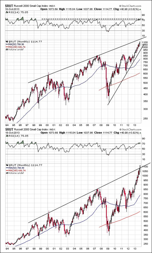
Before looking at the charts, a quick comment. To the point, below is a look at some very long term charts of the major and most popular equity indices. Very simple stuff. But what I’m showing you is a bit of a curve ball. The top graph in each clip is a log scale view of life for that equity index, while the bottom clip is non-log. The important issue is that in each case I’m looking at the long term history of rising tops in each index. As per the logarithmic charts, we’re not quite there yet in terms of hitting these rising tops lines of significance. But when looking at the same index in non-log terms, we’re either sitting right on top of a very long term resistance/breakout line, or we have already modestly risen above the historical series of rising tops. The last issue of importance is that these patterns are completely consistent across all of these major indices. Does that speak to the commoditized character of equities relative to alternative global assets classes of the moment (that are underperforming)? Regardless, I believe these charts are more than deserving of our monitoring as we move ahead.
[Hear More: Greg Weldon: The Bifurcated Economy and Markets - A Turbulent Trading Environment]
Let’s look at the charts as they tell their own stories and I’ll finish with a few comments.

As a quick aside, I could not help but notice monthly RSI has so far put in a series of lower highs at each major nominal price top over the last decade plus. We see this in a number of the indices below along with a few flat line triple top RSI patterns of the moment. At least for the Dow, this is just about as textbook a broadening top formation as one is likely to see in terms of long term price. Again, the individual log versus non-log chart proximity to the rising tops line is clear. You’ll see exactly the same in the charts below.
The mid and small cap indices lay below:
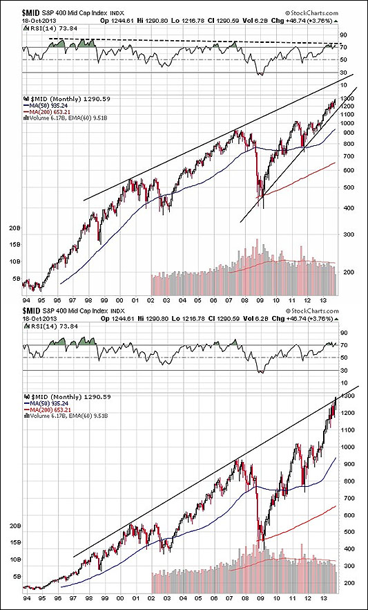
(So far all the charts above show us the declining tops RSI line, but that’s about to change.)
I’ll end with a quick look at the NASDAQ that does not share near exact rising tops price experience since 2000, as we all know. But a rising tops formation since late 2003 to present is relevant.

I’ll keep the closing commentary short as I’m more than sure you get the picture (no pun intended). We’ve seen a number of strategists and pundits talk about the end of the 2000-present secular bear in equities and the beginning of a new secular bull. I would suggest that for those even contemplating such an outcome, monitoring the charts above is critical.
Very quickly, I personally believe breakouts to the upside, if they occur, could be signaling something other than a new secular bull mostly because for now we just do not have the type earnings growth normally associated with secular bull awakenings. Alternatively, breakouts to the upside could be telling us a true bubble in US equities is beginning to form. I do not mean this to sound pessimistic by any means. As always, what is is. Rather, if it is to occur, I personally believe it will be driven by a near historic lack of acceptable alternative investments in a world both awash in liquidity and intentionally starved for rate of return in safe investment vehicles by central bankers. Remember, at the equity peaks in 2000 and 2007, believe it or not even money funds offered more than acceptable rate of return refuge. No longer. A potential US equity bubble would be driven, in my mind, by a growing and near historic sense of “nowhere else to go” with global capital (that is scared of debasement and confiscation).
As simpleminded as this may sound, it’s either very important price breakouts or breakdowns ahead. And given the relatively commoditized nature of equities as an asset class for now (don’t strikingly similar chart patterns suggest as much?), I would expect either breakout or breakdown outcomes to be consistent across the entire group. Given my impeccable historical track record of being 100% unable to exactly predict the future (it’s just a good thing I’m in the very good company of other human beings on planet Earth), I’m need to wait and see where price travels from here. My suggestion to you is to keep the very long term charts on your radar. This is not a time to let personal ego get in the way of respecting market messages.


