After a Failed Breakdown, Stocks Broke Out
In what is a microcosm of the last two years, the S&P 500 broke below its recent trading range roughly two weeks ago. The bearish breakdown quickly turned into a failed breakdown as stocks reversed and shot back up in a vertical manner.
Big Moves Have Come in Both Directions
As a reminder of how quickly things can change in the present day markets, it may seem like a distant memory, but the S&P 500 was in negative territory for 2016 just a short time ago.
A Break Above the Box
The S&P 500’s recent breakout, thus far, is impressive. Since stocks have been moving inside a box for over two years, a significant push above the box is quite possible based on the expression “the longer you go sideways, the bigger the move you can get once a breakout or breakdown occurs”.
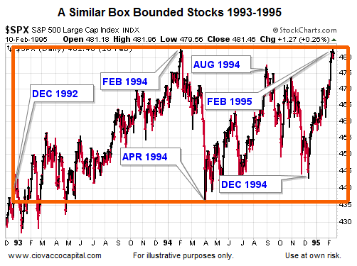
1994: An Anecdotal Example
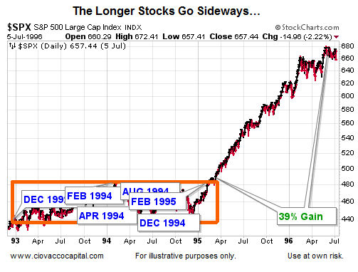
While we understand 1994 is a significantly different period relative to 2016, 1994 can be used to illustrate the generic concept of a long-term consolidation in stocks.
What Happened Next?
Once the multiple-year logjam was broken in early 1995, stocks rallied over 39%.
Is there anything else, other than the 2014-16 consolidation box, that indicates the 2016 breakout in the S&P 500 could have some serious upside legs? Yes, the tweet below from Sentimentrader outlines another in a long line of rare stock market occurrences that we have experienced in the last two years. Prior to the last ten trading sessions in 2016, the market stat described below had occurred only once in the last 20 years. Now we have two examples. The last time it happened, very good things happened in the stock market.
These 2016 Charts Can Assist With Probabilities
Hypothetically, if 2016’s breakout from the stock market box were to be followed by a double-digit push higher, the odds are very good the chart below would do two things: (1) break the pattern of lower highs (see orange arrows), and (2) break out above the top of the box. Those things may happen, but they have not happened yet.
The ratio of stocks to intermediate-term Treasuries paints a similar picture. Compare and contrast the look of the blue boxes on the S&P 500 chart and the two stock/bond ratio charts; all three charts cover the same time period.
How Can We Use This?
Do the charts above negate the S&P 500’s impressive breakout this week? Absolutely, positively, no. The stock/bond charts have additional confidence hurdles that we can use as guideposts. If the stock/bond charts break out, it will increase the odds of (a) the S&P 500 holding its bullish breakout and (b) additional upside in risk assets. Conversely, if the stock/bond charts retain their hesitant look, we can continue to approach the stock market’s breakout in a prudent and measured manner.
Is This a Bearish Analysis for Stocks?
No, it is a bull/bear probability analysis. The stock/bond ratios can help us with bullish probabilities and bearish probabilities. Also, it is difficult to label the 1994 example as bearish.
Related:
Stocks Are in a Bubble or Earnings Just Don't Matter Anymore


