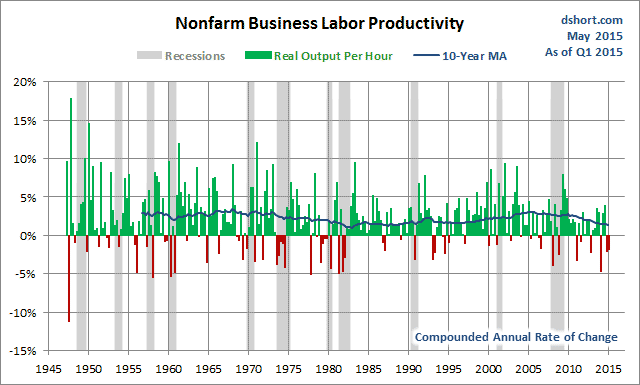
Yesterday the Bureau of Labor Statistics released the preliminary data for Q1 Productivity and Costs. We learned that the headline metric, nonfarm business sector labor productivity, decreased at a 1.9 percent annual rate during the first quarter of 2015. Let's take a look at the BLS's complete data series for this index, which dates from 1947.
As the above chart illustrates, compounded annual rate of change is quite volatile, hence our inclusion of a 10-year moving average.
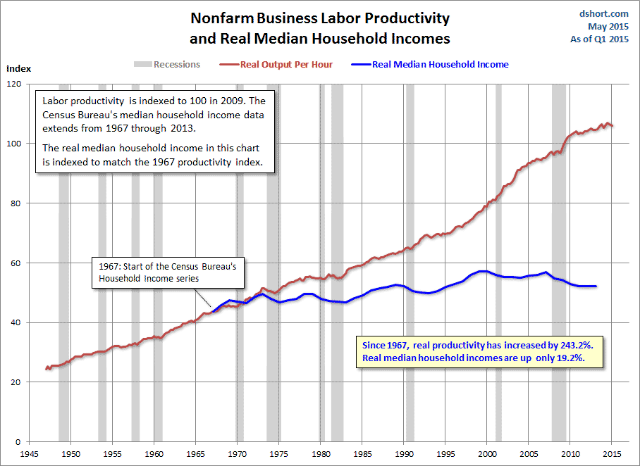
We get a more useful view of the long-term trend by simply looking at the Labor Productivity Index itself, which is currently chained so that the year 2009 = 100.
Now let's overlay real median household incomes, for which we have annual Census Bureau data from 1967 to 2013.
The growth in labor productivity clearly hasn't translated into higher incomes for median (aka middle class) households. Note that the household income data ends at 2013. The Census Bureau will publish the 2014 data in mid-September. That relatively flat blue line, showing a cumulative growth of 19.2% since 1967, is actually 8.7% off its peak, which occurred in 1999 as the market was entering the final phase of the Tech Bubble.
So who actually benefited from the upward trend in labor productivity? Let's look at an overlay of the Labor Productivity Index and a log-scale chart of Corporate Profits.
Now let's examine an overlay all three.
Growth in Labor Productivity has been a boon to corporate profits, but not to household incomes.
So much for the theory of trickle-down economics.
For more readings on household incomes and related topics. see the following:
- Monthly Median Incomes Since 2000
- By Quintile and Top Five Percent
- Median Incomes by Age Bracket
- Deflating the American Dream
- Median Household Income by State
- Household Net Worth
- Disposable Income Per Capita
You May Also Like: Economic Uncertainty Driving Corporate Buybacks?


