


Chair Yellen spoke at the University of Massachusetts-Amherst last week and struck a tone of clarity with markets regarding the upcoming rate hike. After muddying the waters previously with comments that infused uncertainty into understanding the central bank’s thought process, the hawkish comments were greeted warmly.
Yellen is ready to raise rates this year. She emphasized the fact that monetary policy affects the economy with a lag, and that it is prudent to begin the tightening process now to avoid having to tighten too quickly down the road. As economic quarterback, she understands the need to throw the ball to where the receiver is heading, not to where he is now.
Even though this implies tighter US economic conditions down the road, investors have come to see it in a positive light, as it implies faith and strength in the underlying economy.
Yellen’s speech was focused on inflation, the one aspect of the Fed’s dual mandate that is not being met and which has been most responsible for the delayed liftoff. I want to emphasize one point here, and that is this: do not discount the role inflation and inflation expectations will play in determining the future path of interest rates, which is ultimately more important than the timing of liftoff.
[Hear: Brian Pretti on the Federal Reserve’s Decision to Stand Pat]
If inflation does not pick up and begin to trend toward target, we will not see continued tightening and rates will stay very accommodative. Inflation is not something that is simply nice to have, it’s an essential requirement for economic progress at this stage. Inflation reduces the value of debt, a function that is invaluable to a debt ridden society. It slowly eats away the economic drag that high debt causes in an economy.
If the Yellen Fed is wrong, and inflation remains subdued (a very plausible scenario), there will be no upward trajectory for rates at all. Rates will stay low until upward price pressures build.
So be ready for a rate hike, but don’t assume it’s going to be followed by many more.
Switching gears, over the last six to twelve months I’ve tried to help readers maintain perspective on the strong performance of the US economy relative to the deteriorating conditions abroad.
As mentioned previously, the US economy currently employs more people than ever before in history. Those workers are earning more money than they ever have, are producing more goods and services than ever before, and have driven both consumption and corporate profits to record levels.
But conditions abroad do not mirror conditions here, making the “elephant in the room” the question of how likely global growth is to affect conditions here. In pursuit of answering that question, I found two charts that help put the global landscape in focus.
[Read: Where Are the Fault Lines In Global Growth and Markets?]
This first chart, created by the folks at howmuch.net, uses data from the CIA’s World Factbook to determine the relative economic contribution of each country to global GDP. As you can see, the US accounts for nearly one fourth of the global economy.
More importantly, this map should help add some perspective on how impactful deteriorating conditions in some countries are to overall economic conditions. We often hear talking points such as Brazil and Russia being in recession, but wonder just what that means to the bigger picture. Here we can see the relatively small contributions made by those countries and others.
If a country is not listed below, you can assume its contribution to the global economy is very small, and it is lumped into the “Rest of the World” section.

Interestingly, this map also breaks down each country’s economy by sector (services, industrial and agricultural). In the US, according to the CIA’s World Factbook, approximately 80% of economic output is from the service sector. This perspective may be instrumental in understanding why the strong rise in the dollar, which curbs manufacturing, has not had an even larger impact on overall economic growth. Put simply, manufacturing is a relatively small portion of the overall economy.
Moving on, this next chart from Bank of America Merrill Lynch shows the world from a market cap perspective, illuminating the relative size of equity markets across the globe. According to BofA, US market capitalization, at roughly 19.8 trillion, represents 52% of world market cap.
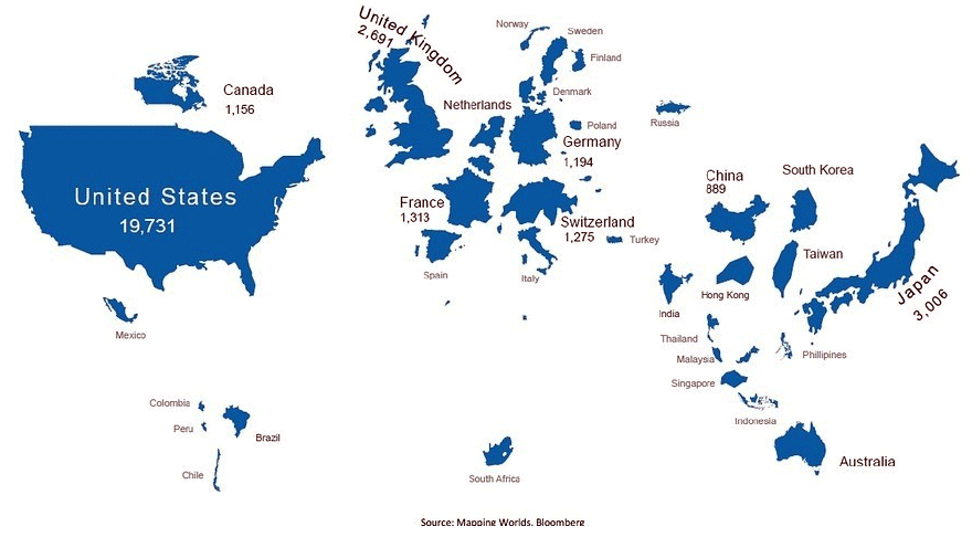
Notice how large Japan is on this map, and also how small some of the emerging market countries are. China appears very small on this map, which may be somewhat misleading. This map is based on MSCI data, which excludes China’s A-shares due to limited accessibility. Were those to be included, China’s market cap would be roughly ten times larger.
Both of the charts above should help add context to the state of the global economy. Now when you hear that markets are crashing, or economies slumping, you can attempt to identify just how big an impact it is likely to have on the global landscape.
The preceding content was an excerpt from Richard Russell's Dow Theory Letters. To receive their daily updates and research, click here to subscribe.


