


Most averages are creeping higher today, but the last couple of weeks of volatile price action has caused some significant damage to the charts. In particular, there are concerns developing in the S&P, the small-caps and the Transports.
Let’s begin with the S&P.
Below you can see a daily chart of the S&P 500 showing the development of a possible head and shoulders top. The left shoulder and head have been completed, with this latest downswing taking prices back to the neckline, near 2420. The index has also fallen below its 50-day moving average, which is starting to roll over.

Between Friday’s and yesterday’s action, we’ve seen two “stabs” to the downside, where the bears tried to take prices lower midday and failed. The candlestick that you see in yellow currently has a shape known as a hammer. This is considered a bullish pattern during a downtrend, especially when it occurs around a level of support.
Given yesterday’s close, it suggests that short-term action could be to the upside. But even if that’s the case, we’re not out of the woods. A failure of the S&P to break above its previous high near 2480, and a subsequent move back to the neckline, would help solidify the building head-and-shoulders pattern.
Related: Patience Is Still Advised
Now that we’ve taken a look at the large-caps, let’s take a look at their smaller, more domestically oriented brethren.
This chart of the Russell 2000 shows some disturbing developments. After reaching a new high in late July, small-caps have nosedived. They recently crashed through both their 50 and 200-day moving averages – the latter being a more significant signal – and are attempting to rally today from a key area of support near 1350.

Taking a longer-term view, the action in the Transports doesn’t look all that bad … yet. Notice that throughout 2017 the transports have been setting new highs, but not new lows. Each decline has met and rallied off support at 1350. IF 1350 continues to hold (meaning the Transports do not set a “lower low,” then we could see the advance resume on a longer-term basis moving forward.
This next chart doesn’t provide many clues as to the market’s next move, but it does have an interesting story to tell. It shows the relative strength between small-caps and large-caps going back to before the election.
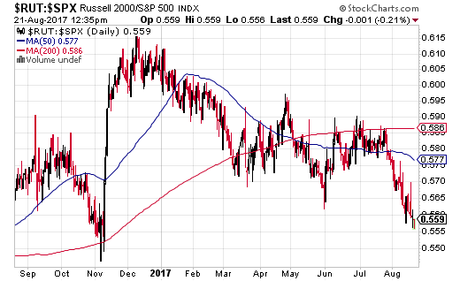
Notice the massive spike in this ratio in the aftermath of the election. At the time, the promise of new healthcare legislation, tax reform, repatriation efforts, deregulation and infrastructure projects made the outlook for domestically oriented small-caps look quite tasty.
But then reality set in.
The administration fumbled the ball on domestic policy changes every time they touched it, while the rest of the world started looking brighter. The end result is that during this latest earnings season, international strength helped bolster large-cap names with international exposure. We saw this in the fact that companies with significant international exposure reported significantly higher earnings growth than those companies without.
Read: Major Breakout in Emerging Markets
The net result, as you can see, is a reversal in the prospects of these two groups. Should we get closer to any real changes here in terms of domestic policy, the small-caps should benefit, but so far it’s been nothing but fits and starts.
Moving on, we also have unnerving developments in the Transports. Below you can see that like the small-caps, the Transports have also collapsed below their 50 and 200-day moving averages. Larger and larger price swings are also causing the Transports to trace out a megaphone or broadening formation.

These types of formations can go either way and suggest a very divided market. So, unfortunately, we’ll have to just wait and see how things play out.
Now that we’ve discussed the current technical landscape, I want to switch gears for a moment and talk about leading economic indicators.
To begin, here’s a chart of The Conference Board’s Leading Economic Index for the US The most recent data was just released for July and showed a 0.3% rise in the index.

This index is based on 10 leading economic indicators and has a reliable record of predicting economic recessions 6-12 months out. The fact that it continues to advance suggests that the probability of a US recession within the next year is low.
See: Current AI Recession Forecast: June 2019
What about the rest of the world?
Here’s the most recent data country by country.

Notice that most of the world is seeing positive developments across their leading indicators as well. Notably, China’s LEI climbed 1.6% and the Euro Area rose 0.6%. Also, the declines that we do see tend to be very minimal, with perhaps the exception of India.
Altogether, these figures suggest that US economic footing remains sound, as does that of most of the world. In turn, this tells that any weakness we see in stock prices should be used as a buying opportunity, at least for those of us who are underweight equities.
Before wrapping things up, I’d like to show two more charts – one that fits with our theme today and another that is just frankly an interesting chart.
Below we have a chart of DBB – the PowerShares DB Base Metals Fund. Rather than track all commodities, this ETF focuses on industrial metals … those used to make everything from airplanes to smart phones.

As you can see, there’s been a strong rally in base metals such as copper, aluminum, and zinc. Weakness in the dollar definitely has something to do with this, but interestingly, commodities as a group have not acted this way … just the base metals. So there is something to be said for a rise in the prospects of global growth. In my opinion, what we are seeing here tends to jibe with what we’re seeing in leading economic indicators across the globe.
As a side benefit (or drawback, depending on your positioning), a sustained rise in the base metals could put upward pressure on inflation, as they represent the basic building blocks of just about everything. That, in turn, would mean central banks around the world could further normalize policy, or at least withdraw some emergency measures. So let’s hope this rally is real and doesn’t just amount to price swings caused by speculators.
Finally, the interesting chart below was created by Carl Swenlin over at stockcharts.com. It shows us how the S&P has ebbed and flowed with regard to valuation levels over time.

In the chart, the black line is the actual S&P index, and the three colored lines show where the S&P would be if it was trading at different P/E ratios (10, 15 and 20). I find it rather interesting to see how valuation levels have changed over time as the market discounts improving and then deteriorating economic conditions.
Right now we can see that the market is priced at historically expensive levels. This should be cause for caution, but remember that market valuation is not a timing tool. There are many factors (such as the extraordinarily cheap cost of money) that are supporting higher than normal valuations.
Must read: Puplava: We're in the Final Phase of Another Market Bubble
In sum, while a lot of technical damage has been done, it’s still a bull market and the economic outlook remains stable. Therefore, any weakness should be used an opportunity to refine and build positions, not liquidate them.
The preceding content was an excerpt from Dow Theory Letters. To receive their daily updates and research, click here to subscribe. Matt is also the Chief Investment Strategist at Model Investing. For more information about algorithmic based portfolio management, click here.


