A decade that began with Britain's recognition of Taiwan and troops from the North Korean Army crossing the 38th Parallel on their way to Seoul in June of 1950, and ended with the signing of the Antarctic Treaty, by which twelve countries including the USA and the USSR (remember them?) set aside Antarctica as a scientific preserve and banned all military activity on that continent, saw enormous changes take place in a post-WWII world that was struggling to come to terms with its new identity.
The Suez Crisis in 1956 heralded the beginning of the end for the once-mighty British Empire, and the Cuban Revolution brought to power Fidel Castro who, when he stepped down from office 52 years and 62 days later, had become the world's longest-serving ruler (eclipsing Kim Il-sung of Korea by almost seven years). But somewhere in between the Taipei "Hello" and the "Keep off the Snow," an amazing discovery took place that would have its moment in the sun half a century later.
The origins of this world-changing find are largely unknown, though it is commonly believed to have originated purely by accident when a nurse treating a diabetic patient accidentally spilled some dihydroxyacetone (DHA) on his chest whilst changing his drip. The following day, the nurse noticed that the patient's skin was discoloured.
In no time at all, a product incorporating this discovery hit the marketplace in America that was, rather curiously, aimed at the less likely half of the human demographic. Its name said it all: Man-Tan.
Prior to the 1920s, a deep tan was considered déclassé—the result of a peasant life working on the land—but all that was to change when Coco Chanel stepped off a friend's yacht in Cannes in the blisteringly hot summer of 1923 sporting a nasty case of sunburn. Just like that, a tan became the must-have accessory for the glitterati:
(UK Guardian): "Coco Chanel made suntans the height of fashion in the 1920s, as a key component of Riviera chic," says Justine Picardie, author of a new Chanel biography. "In doing so, she turned fashion on its head, so that bronzed skin became emblematic of glamour rather than peasantry; of a leisured life rather than outdoor labor." By the end of the decade, the poor had left the fields for factories, and, helped along by Chanel, the trend for brown skin began.
But in the search for a shortcut to a wealthy-looking appearance, Man-Tan (and many of its early antecedents) came up woefully short:
Man-Tan turned its users a rich beige-orange—less "tan" coloured, more "swum through a lake of fruit juice". Quick Tan Lotion by Coppertone was launched soon after—it speckled skin, stained palms and discoloured clothes...
Half a century later, though, what has euphemistically become known as the "self-tan" (though for the purposes of today's discussion, I shall refer to it by its more apropos monicker—"fake tan") had become the fastest-growing sector of the international cosmetics market. By 2005, 30% of British women were using fake tan, and by 2008, Liverpool was awarded the dubious epithet "Britain's most-tanned city" with a staggering 59% of women applying fake tan lotion upwards of five times per month.
The arrival on US TV screens of Jersey Shore helped cement the fake tan's place at the center of US culture and the public's love affair with obtaining a quick-and-easy, seemingly healthy appearance was established.
A year-round tan implies the sort of wealth and status that allows for regular trips to the sun and gives the wearer a surge in self-confidence, but, of course, human nature being what it is, the wheel inevitably turns full circle and the backlash against the fake tan has now begun.
The simple truth that has reasserted itself is timeless; fake is just... well, fake.
Human beings have a visceral dislike of anything fake—though sometimes they will put up with imitations on a temporary basis if needs must (show me an owner of a fake Mulberry handbag who doesn't aspire to owning the real thing, and I'll show you a liar)—and that deep-rooted sense is fast going to become a big problem for none other than Ben Bernanke.
This past week, the Fed chairman once again reached into his magic bag of tricks and announced yet more stimulus—this time in the form of an additional $40 billion of outright Treasury purchases each and every month. Added to QE3's promise to buy $45 billion of MBS on a monthly basis, a grand total of $85 billion will be sucked up every 30 days until... well, therein lies the big change. This time around, the monetary spigots were opened wide and we were told to watch the BLS-generated rate of unemployment (amongst other things) for clues as to when they'd be closed again:
(FOMC): "In particular, the Committee decided to keep the target range for the federal funds rate at 0 to 1/4 percent and currently anticipates that this exceptionally low range for the federal funds rate will be appropriate at least as long as the unemployment rate remains above 6-1/2 percent, inflation between one and two years ahead is projected to be no more than a half percentage point above the Committee’s 2 percent longer-run goal, and longer-term inflation expectations continue to be well anchored. The Committee views these thresholds as consistent with its earlier date-based guidance. In determining how long to maintain a highly accommodative stance of monetary policy..."
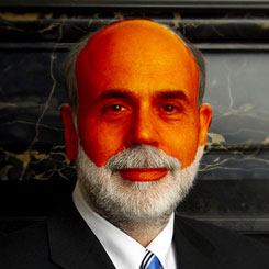
Bernanke and his fellow Beltway insiders continue to apply fake tan in an attempt to make the US economy look more healthy than it is, but even though the public has been in love with the bronze monetary sheen that has been sprayed onto a decidedly pasty economy repeatedly since 2008, the backlash I spoke about is picking up steam and broadening its reach.
This week's announcement of QE4—against a backdrop of no real material deterioration in the US economy since QE3 was announced—looks to have been a watershed in the evolution of unlimited and regular stimulus as the reactions of various instruments demonstrated.
It's not just the tying of this round of QE to the unemployment rate that is different. No, sir. It's also the market's reaction to what is essentially unlimited moneyprinting.
Yes. Unlimited. Now, I know what they said about unemployment, but if you read the statement again carefully, you'll see where all the wriggle room is:
"...this exceptionally low range for the federal funds rate will be appropriate at least as long as the unemployment rate remains above 6-1/2 percent, inflation between one and two years ahead is projected to be no more than a half percentage point above the Committee’s 2 percent longer-run goal, and longer-term inflation expectations continue to be well anchored."
Clever!
Obviously, if there were a hard-and-fast commitment to cease all stimulus as soon as the unemployment rate hit 6.5%, the market would begin frontrunning that event way in advance of it happening (and that frontrunning would, rather inconveniently, take the form of mass selling of the very bonds for which the Fed has provided a bid). By adding two other contingent conditions to be simultaneously met, and ensuring the 6.5% level is simply a guideline, the Fed has essentially given itself all the justification it needs to not cease stimulus until it is good and ready to do so.
But just like the female inhabitants of Liverpool, whose fake tan needed to be applied with ever-increasing frequency, the gaps between applications of cosmetic stimulus actions by the world's central banks are also narrowing quickly:
Chris Martenson, of Peak Prosperity, put the strange reaction to QE4 this week beautifully:
If you had stopped me on the street a few years ago and asked me what I thought would have happened in the stock, bond, foreign currency, and commodity markets on the day the Fed announced an billion per month thin-air money printing program directed at government bonds, I never would have predicted what has actually come to pass.
I would have predicted soaring stock prices on the expectation that all this money would have to end up in the stock market eventually. I would have predicted the dollar to fall because who in their right mind would want to hold the currency of a country that is borrowing 46 cents (!) out of every dollar that it is spending while its central bank monetizes 100% of that craziness?
Further, I would have expected additional strength in the government bond market, because billion pretty much covers all of the expected new issuance going forward, plus many entities still need to buy U.S. bonds for a variety of fiduciary reasons. With little product for sale and lots of bids by various players, one of which—the Fed—has a magic printing press and is not just price insensitive but actually seeking to drive prices higher (and yields lower), that's a recipe for rising prices.
Then I would have called for sharply rising commodity markets because nothing correlates quite so well with thin-air money printing as commodities.
That's what should have happened. But it's not what we're seeing.
No. It's not. Not yet.
Chris goes on to make the very point that I have been making for some time now:
The markets are now well and truly broken. Not because they don't conform to my predictions, but because they are no longer sending useful price signals.
Underneath the fake tan applied by Benny & The (Ink)Jets is a pasty economy as can be seen from a cursory glance at a few recent economic statistics, starting with the number of foodstamp SNAP recipients in the United States—a number that has grown in unbelievable fashion since 2009. In September and August combined, over 1 million Americans entered the Supplementary Nutritional Assistance Program.
Comparing the number of new SNAP recipients to jobs created since December 2007 shows again just how pasty white the US economy is underneath the fake tan:
But it's not just SNAP, Buckle, and Drop.
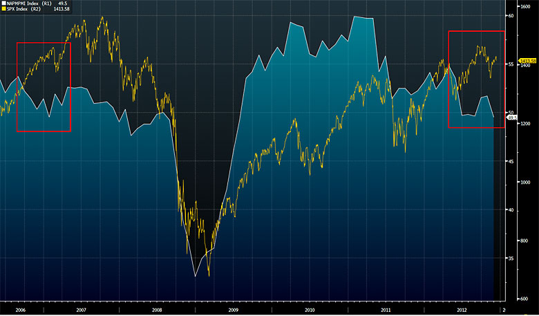
The chart above shows the S&P 500 (yellow line) versus the Institute of Supply Managers (ISM) Purchasing Manufacturers Index (PMI). The PMI is a barometer of the economic health of US manufacturing, and, as you can see from the chart, it has slipped back into contraction (below 50). Not only that, but the drop-off has been sharp and the last time we saw divergence like this between the PMI and the S&P (red boxes), it didn't end very well.
Next we look at real annual earnings (courtesy of Doug Short) and see that not only have they gone sideways for the last three years, but that they are currently falling at the sharpest rate since the (alleged) last throes of the 2008 recession:
Which brings us back to unemployment—something that is now going to be the focus of Fed-watchers after policy was linked to the unemployment rate this past week.
Headline unemployment numbers are (CPI notwithstanding) some of the hardest to understand/easiest to spin, and that doesn't bode well for anyone who believes that there will be a cut-and-dried end to quantitative easing the second the unemployment rate hits 6.5%.
The unemployment rate (U3) targeted by the Fed has fallen from 10% to its current 7.7% since October 2009, and that has, understandably, been cause for a lot of chest thumping and backslapping, but there are a couple of other metrics that bear inspection in order to gain a better understanding of the realities of US unemployment.
First is the U6 unemployment measurement. This, according to the BLS website, includes:
Total unemployed, plus all persons marginally attached to the labor force, plus total employed part time for economic reasons, as a percent of the civilian labor force plus all persons marginally attached to the labor force.
And second is the participation rate (which has been the real key to the fall in the headline U3 unemployment rate in the past two years).
As people have fallen out of the workforce in their droves (green line), the headline rate has come down dramatically, but, as you can see from the chart below, the gap between U6 (blue shaded line) and U3 unemployment (yellow line) has not narrowed:
It doesn't end there. We could look at consumer confidence numbers, small business sentiment, trade deficit numbers, and many others—but we won't.
Cast your minds back to the era of "Green Shoots" (remember them?) and try to remember when you last heard that phrase. There is a very good reason for that—the same way there is a very good reason for the Fed's renewed and seemingly open-ended application of monetary steroids this past week; beneath the fake tan, the economy is positively anemic.
By linking the application of QE to the unemployment rate (though not hard and fast), the Fed has taken one more step down a road it is just itching to travel but can't quite take the first step.
If only somebody else would lead the way...
As luck would have it, the appointment of Mark Carney as the new governor of the Bank of England this month could turn out to provide them with the powerful ally they need:
(FT): In his first speech since winning the top job at the Bank of England, Mr Carney, now governor of the Bank of Canada, suggested three measures that central banks could take in "exceptional times" such as the present.
When central banks had exhausted the possibility of cutting rates, Mr Carney said, they could pledge to keep rates on hold for an extended period...
Check.
...If that did not work, then they could promise to keep rates low until unemployment fell...
Check.
Both are measures that Sir Mervvn [King] has rejected. If neither of those had the desired effect, Mr Carney suggested, there is a more radical alternative: scrap the inflation target in favour of a nominal gross domestic product target.
Ahhh... now there's a thought... unlimited money printing until a pre-arranged level of growth has returned. Well... I suppose if the Bank of England is doing it...
At the point where nominal GDP is targeted instead of an unemployment rate, we will have finally crossed the Rubicon. The way things look right now, the only way we may not get there is if the bond market revolts before they can conjure up the right set of circumstances. Otherwise we are headed in that direction.
If, ultimately, we reach the stage where central banks are using nominal GDP targeting to determine when to stop the printing presses, who knows how ridiculous the Fed chairman will look?
*******
I couldn't leave you this week without mentioning the rather extraordinary recent goings-on in the vaults beneath the Bank of England.
As regular readers will know, below the Bank of England, gold is stored on behalf of the central banks of many countries around the world. The reason given for this is the proximity to the London Bullion Market—by far the world's largest OTC bullion trading center.
As has been documented (both in these pages and countless others lately), the trend towards repatriation of gold reserves by governments has been quietly picking up a head of steam in recent months with the Bundesbank the most recent and most high-profile institution seemingly set upon perfecting their assets.
(Mineweb): Last week, a report by Germany's Federal Auditors Office was made public by the media including the Associated Press. The document observed Germany's gold bars "have never been physically checked by the Bundesbank itself or other independent auditors." Instead, it relies on "written confirmations by the storage sites."
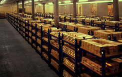
Bizarrely, we were treated this week to not one, but two looks inside the Bank of England's bullion vault as first the rather excitable Professor Martyn Poliakoff (see video on page 31) took a cameraman inside the hallowed room for a look around that received plenty of exposure, and then, just a couple of days later, the somewhat less-excitable Queen Elizabeth II toured the facility, which received even greater publicity right around the world.
With the question marks surrounding the veracity of the reported holdings in not just the Bank of England's vaults but those of the Federal Reserve as well as Fort Knox in the US growing larger with each request for repatriation, what better time to wheel Britain's monarch through a room full of gold bars to show the world that everything is just hunky-dory.
Cynics and conspiracy theorists will no doubt have a field day with these stories, but away from the calming effect that the sight of all that gold bullion was no doubt designed to have, another fact struck me as far more pertinent.
The story of Poliakoff's visit to the vault as reported in the UK Daily Telegraph began thus:
(UK Daily Telegraph): Beneath the Bank of England in London lies 4,600 tons of gold.
The Bank's precious metal reserves, worth £197 billion (5bn) according to the mostly recently published figures, are rarely seen by outsiders...
Two days later came the FOMC statement:
To support a stronger economic recovery and to help ensure that inflation, over time, is at the rate most consistent with its dual mandate, the Committee will continue purchasing additional agency mortgage-backed securities at a pace of billion per month. The Committee also will purchase longer-term Treasury securities after its program to extend the average maturity of its holdings of Treasury securities is completed at the end of the year, initially at a pace of billion per month.
So, to put that into perspective, in the space of just under four months, the Fed will buy Treasury bonds and MBS that exceed the value of all the gold held beneath the Bank of England on behalf of multiple central banks around the world.
This disconnect seems to be lost on most market participants (as the strangely muted reaction of the gold price after the FOMC announcement demonstrates), but, with the amount of gold in the world increasing by roughly just 2% per year, the incredible (in the truest sense of the word) increase in the monetary base is one day going to be seen for what it is, and the mathematics of the situation will permeate the collective consciousness.
In closing, I'll just point out that, in roughly 6,000 years of recorded history, approximately trillion of gold (at today's price) has been mined.
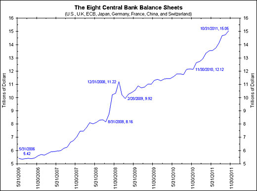
On August 31, 2008, the combined value of the balance sheets of the US, UK, ECB, Germany, France, China, and Switzerland stood at .16 trillion. By October 31, 2011, that total had reached .05 trillion.
In other words, it took eight central banks about five years to fabricate the equivalent value of 6,000 years' worth of gold production and, since the chart below finished, they have added another couple of trillion dollars.
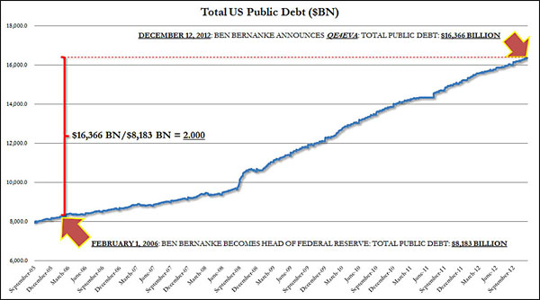
Or, if it helps, look at it another way; in just under seven years, US public debt alone has increased from a little over trillion to .3 trillion—a difference equal almost exactly to all the gold ever produced in the last 6,000 years.
Call me old-fashioned, but I'm sorry. Gold ain't no bubble.
*******
Once again, I have rambled on far longer than I had intended when I began writing, so I'll leave you with a quick rundown of what you can expect to find in the pages that follow.
Working backwards, in the videos section we have the wisdom of Bill Fleckenstein and Jim Grant, the ramblings of yours truly (the interview is part of Financial Sense's premium service and will consequently cost you 99c to listen to) and an extremely excitable chemistry professor surrounded by gold bullion.
We have charts of welfare spending, the Japanese yen, US house prices, and Henry Blodget's take on the mobile industry as well as 140 years of US inflation.
We travel to Chongqing, China, to see the legacy left by Bo Xilai, hear from Poland's central banker extraordinaire, Leszek Balcerowicz, get Ambrose Evans-Pritchard's thoughts on a wide range of topics, and hear from Germany why France is in denial.
Another Euro Summit ends in stalemate, we take a close look at Angela Merkel's role in the euro crisis, find out that all Tim Geithner has to do is say the word and a trillion platinum coin could ride to his rescue, and John Hussman explains "Roach Motel Monetary Policy."
Until next time...
CLICK HERE to subscribe to Grant Williams' Things That Make You Go Hmmm... and receive the full report free via email.


