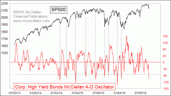
The regular McClellan Oscillator is based on Advance-Decline (A-D) data for the NYSE. But the same calculation can be done on other sets of A-D data. This week’s chart looks at an interesting example of that, with a big message for the current moment.
The Financial Industry Regulatory Authority (FINRA) kindly publishes data on Advances and Declines for corporate bonds, breaking out totals for Investment Grade, High Yield, and Convertible. Each category is interesting in its own right, but I find the High Yield numbers the most interesting, perhaps because of the strong correlation that such bonds have to the movements of the stock market.
Interview Tom McClellan: Presidential Election Cycle Indicates a Market Pull-Back in the Fall
This particular version of the McClellan Oscillator for High Yield Bonds is calculated the same way as for the NYSE A-D data. But because the number of issues traded are different for each market, the raw scaling is therefore necessarily going to be different.
Once we get past that notion of scaling, and just focus on the chart itself, we can pretty easily see where “high” and “low” readings are. I drew a horizontal line at the arbitrarily chosen level of -75 to help focus the eye on the situation we see right now. Very low readings below that line tend to reliably be associated with meaningful bottoms for the SP500. I should caution that the notion of “meaningful” bottoms does not mean the same thing as “final” bottoms.
But such bottoms are usually followed by meaningful bounces, if not outright up moves. That is the important message. What we are seeing with this very low reading is a message that the stock market is at a meaningful bottom and ought to see a brief pop, at a minimum. What happens after that is a more difficult question to address.
It is not only the McClellan Oscillator for these data which has merit. A raw Advance-Decline Line (A-D Line) can have value on its own, when it signals a trend change.
When the High Yield Corporate Bond A-D Line crosses through a long trendline, it is a pretty darned good signal of a trend change. Some examples are shown in this second chart.
This is important now because we have just seen such a crossing, this time below the rising bottoms line that dates back to the Feb. 2016 low. That line has been fairly authoritatively broken, and now this A-D Line is also threatening to close below its own 5% Trend (AKA 39-day EMA), an act which would add further confirmation of a trend change.
High yield bonds had come back into fashion in 2016, as the central banks’ policies of zero or negative interest rate policy has pushed investors into more risky assets. The pendulum appears to be swinging back again, although it has swung really far already on the first push, as evidenced by the extremely negative McClellan Oscillator reading shown above. That says the initial down leg may have gone too far too fast all at once.
But the broken uptrend lines says we are seeing a significant trend change getting started right now. Both messages are worth acknowledging.
Related Charts
Aug 12, 2016 | Jul 13, 2016 | May 26, 2016 |


