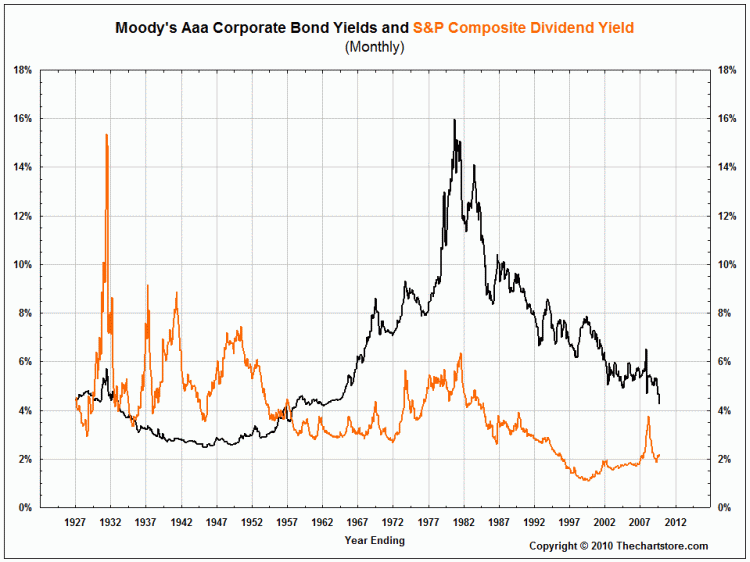
The following chart compares Moody’s Aaa bond yields with the dividend yield of the S&P Composite. Notice that stock yields remained above bond yields from 1929 until the mid 1950’s.
Click picture for sharper image
The following chart compares Moody’s Baa bond yields with the dividend yield of the S&P Composite. Notice that here, too, stock yields remained above bond yields from 1928 until the mid 1950’s. Stocks were considered to be more risky than bonds in those days.
Click picture for sharper image
The next two charts compare Long-term U.S. Treasury and 10 year U.S. Treasury bond yields with the dividend yield of the S&P Composite. In both cases, stock yields remained above bond yields from 1928 until the late 1950’s.
Click pictures above for sharper images
There has been discussion more recently about the S&P Composite earnings yield (the inverse of the P/E ratio) spiking above bond yields. Some consider this to be a bullish development. If one were to only look back to the early 1980’s, such an event is truly unusual. However, if one broadens the time frame back to 1928, it becomes obvious that the event was quite commonplace, if not the norm, prior to 1967.
The following four charts compare the various bond yields to the S&P Composite earnings yield from 1928 to August, 2010.
Click pictures above for sharper images
Our last chart shows Silver - Handy and Harman (weekly spot) – along with the 12 and 26 exponential moving averages and the MACD oscillator. Could Silver be breaking out of its consolidation to the upside?
Click picture above for sharper image


