It seems bearish analysis and articles are popular these days. From a contrarian perspective, that is a good thing for the longer-term bull. Any experienced investor or market professional knows the current market is going to correct at some point, probably within the next month or so. Based on fundamentals and technicals, our analysis below makes what we believe is a strong probabilistic case the next correction will not kick-off a new full-blown bear market.
The current market is extended, which does make it hard to justify investing significant amounts of cash. However, we can prepare a correction short list in the event a pullback occurs in a somewhat orderly manner - consistent with a normal retracement within the context of an ongoing bull market. Should a more attractive entry point present itself in the coming days or weeks, we will consider the following ETFs/sectors as possible buy candidates. Candidates infers we are not ready to buy at current levels and under present conditions.
In terms of our short-term strategy, we are happy to hold our current positions, including those established in early December 2010 for the first half of 2011. After Thanksgiving, our models pointed us to energy (XLE and IEZ), industrials (XLI), technology (QQQQ), and consumer discretionary stocks (XLY). Since the S&P 500 has hit two logical areas of resistance near 1,315 and 1,326, we are also open to protecting some profits if it appears the long-awaited correction is begging to unfold.
As an investor or trader, you can look for articles, opinions, and analysis that align with your point of view, which may make you feel better, but it may not help you make money. If you read a bearish analysis, a good idea is to check the author’s article archives since the 2010 summer lows. Has the author remained stubbornly bearish even in the face of an obviously strengthening market? How long has the author been making bearish calls? Is the author a “chicken little” perma-bear?
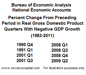
If you are a long-term bear, you may want to temper your visions of the S&P 500 heading back to levels below 1,130 anytime in the next few months. The two primary fundamental arguments against the onset of a new bear market are related to GDP and the Fed. As we mentioned in Are We Headed For A Recession and Bear Market?, bear markets are usually associated with negative GDP. If you have been investing or trading for a number of years, you know the periods shown below were difficult to make money on the long side.
Even the always full of sunshine ‘new normal’ crowd threw in the short-term bearish towel late last year when PIMCO raised their 2011 full-year GDP forecast to 3.0 - 3.5%. The Wall Street Journal consensus has the economy growing by 3.3% this year, and the forecast from the Blue Chip Economic Indicators is for 3.1% growth. If GDP growth reaches either of those forecasts, it will be the best since 2005 and not even close to levels usually associated with new bear markets.
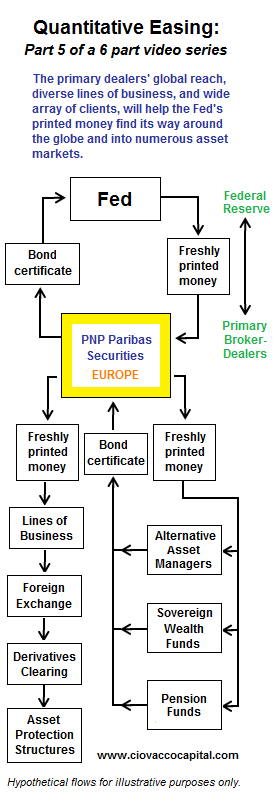
Despite significant longer-term concerns, including bloated government budgets, out of control entitlements relative to the demographics expected to support them, a large shadow inventory of homes, and lending standards that will try the patience of members of the 800-credit-score club, a long-term bear must respect the buying power of the Fed’s eighteen primary dealers who continue to exchange government bonds for the Fed’s freshly-printed cash.
The primary dealers have a global footprint and wide tentacles that stretch into almost every conceivable corner of the financial markets. Their buying power and ability to make shorting a potentially unpleasant experience needs to be understood and respected by all market participants. The flow chart below shows how the Fed’s QE2 cash can easily find its way into the global asset markets. A video (or link to a video) explaining the flow chart below is available at the end of this article – we believe even experienced investors may raise an eyebrow or two during the video. It is not a coincidence that the markets rallied from a fragile bull/bear demarcation line immediately after Ben Bernanke’s Jackson Hole speech on August 27, 2010, which basically said QE2 was on the way. PNP Paribas (see figure’s yellow box) is one the Fed’s eighteen primary dealers.
Given that GDP and the primary dealers continue to favor bullish outcomes for a few more months, the technicals also hint strongly that bears that get too excited during the next correction may be in for a big disappointment. Below, we present two charts that look complicated, but in fact are easy to understand since they illustrate the simple concept of stock market support. Support refers to areas that were important to buyers and sellers in the past. Levels that were important in the past usually remain relevant during a correction. The chart below looks at short-term areas of potential support that were mainly established during the bullish move off the summer 2010 lows.
The second chart (below) takes a longer-term view of the S&P 500 Index going back to late 2006. The red and black rectangles, known as candlesticks, represent the S&P 500. The thin colored lines are different moving averages for the S&P 500. Moving averages help us filter out noise, in the form of day-to-day volatility, and identify the primary trend in the market. You can see the primary trend turned down in 2008 and did not turn back up again until early spring of 2009. These moving average bands have acted as both support (green) and resistance (red), which identifies their past importance in the minds of market participants. Notice how the rally in early 2010 was turned back by the moving average band (resistance in late April).
The S&P 500 was able to break above both moving average bands in late 2010, which was a major milestone for the bulls. Should the market experience a correction of 7% to 8%, the intersection of the two moving average bands near 1,200 will offer a very difficult barricade for the bear to penetrate, especially on the first attempt.
Our 2011 stock market outlook and video explained the potentially bullish significance of the Q4 2010 break above the moving average bands. The analysis and video are still relevant since they can now help us better understand why these levels will act as strong support for the bulls. If you understand why the breakouts were bullish, you will also understand why a full-blown bear and deflationary episode is highly unlikely on the first pass back to these moving average bands (if it occurs). View video.
No one, including us at CCM, can predict the future; the best we can do is study the present, within the context of market history, and make rationale, probabilistic forecasts. A good rule of thumb in the markets is if anyone tells you they know what is going to happen, stop listening or stop reading. If the speaker or analysis uses terms like odds, probabilities, and possible outcomes, review their arguments with an open mind and make your own call. One of the great things about investing, trading, and the markets is there are numerous ways to successfully skin the cat. Our objective should be to make money, not to be right, or even to agree with the market’s perspective. Arguing with the market, the Fed, and the primary dealers can be harmful to your wealth. If you are right, but not making money, are you really right? The video below, mentioned earlier in the article, describes how QE2 works in the real world and its possible ongoing impact on asset prices and your portfolio. View video.
Can experienced and adept traders make money on the short side of the market during the next correction? Sure they can, but the evidence we have in hand today does not support making full-blown bear market bets. If the evidence changes, we are happy to join the bearish camp.


