 Modern investing offers the promise that investors who "do their homework" and use data more intelligently than the herd can gain a valuable edge. But what if the underlying data available to the investing public is fundamentally flawed?
The federal government agencies that issue headline data and the mainstream media that reprints the data without skeptical analysis would have us believe that these indicators -- the unemployment rate and the consumer price index (CPI), for example -- accurately reflect economic realities.
The other indicator that is implicitly or explicitly assumed to reflect the economy’s health is, of course, the stock market, generally represented by the S&P 500 index.
That the government indicators and the stock market are both suspect is now a given.
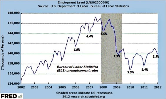
The chart below, one of many possible examples, proves this suspicion is well-founded. This is a chart of a broad measure of employment in the U.S. published by the U.S. Department of Labor, Bureau of Labor Statistics (BLS). As we can see, when 140 million people had jobs in 2009, the official unemployment rate was 7.3%.
Yet when 140 million people had jobs in early 2012, the unemployment rate was 8.3%. How can the rate change when the number of jobs remain constant? The reason is that the unemployment rate is based not just on the number of jobs but on the number of people who are ready, willing and able to work—the labor force. The unemployment rate is based on the labor force minus the number of employed equals the number of people counted as unemployed. The government games the unemployment rate by keeping the labor force number artificially low. Despite the working-age population rising by 9.4 million people since 2008, the official labor force has been 154 million since 2008. Where did the government put all those millions new workers? In the “not in the labor force” category, which rose by roughly 8 million since early 2009. In other words, dropping millions of people from the labor force artificially lowers the unemployment rate.
It doesn’t take any fancy analysis to conclude that if the true labor force were counted, then the unemployment rate would be much higher -- and that is, of course, politically unacceptable.
So the numbers are gamed, massaged, adjusted... However you choose to describe it, the “headline number” of unemployment reflects political expediency, not reality.
The same can be said of the CPI and a slew of other headline data points issued by the government and blithely accepted by a corporate mainstream media committed to presenting the “recovery” as real.
If We Can’t Trust Headline Indicators, What Can We Trust?
If these headline indicators are not a reliable reflection of economic reality, what is?
To the degree that any government statistic can be massaged, seasonally adjusted, or simply rejiggered behind the curtain, we must always be alert to the possibility that numbers have been gamed for political expediency.
But the farther we move away from headline numbers, the farther we also get from the political pressure to make the numbers either positive or benign. For example, relatively few people are going to study chart PRS85006173, showing labor’s share of the non-farm business sector (i.e., the vast majority of the economy).
This charts reveals that labor’s share of the economy has been falling sharply since the dot-com top in 2000, and has been in a downtrend of lower highs and lower lows since 1982. This suggests that the number of counted jobs (which includes part-time, temporary, and self-reported self-employed) may be less valuable as a metric of economic recovery than income and labor’s share of the economy.
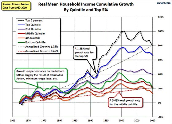
Indeed, if income is adjusted for inflation, then real household mean incomes have been declining since the housing-credit bubble topped in 2006-7:
In the following chart, income is not adjusted, and so it appears to be resuming its decades-long ascent. But if we add household debt, then another picture emerges, one of household debt rising far faster than income. Debt must be serviced, and rapidly rising debt imposes a burden on household income. Income may be rising in nominal terms, but if it is declining in real terms and the debt that must be serviced out of that income is skyrocketing, then how meaningful is nominal income?
Rather than reflecting meaningful growth, the apparently rising nominal income deceptively masks the reality of declining real income and avoids the costs imposed by a stratospheric rise in debt.
Since income is taxed, then tax receipts are another measure of income. Obviously the amount collected depends on the tax rates that are in effect for that year, so tax receipts may decline if tax rates fall. Nonetheless, in aggregate, tax receipts are a metric that is difficult to game or “seasonally adjust” to serve political expediency.
Here is a graph of total federal tax receipts.
Note that the data is not adjusted for inflation; it is nominal. We can see the sharp declines in federal tax receipts after the dot-com and housing bubbles popped, along with the resurgence of tax receipts in the “recovery.”
According to the BLS, what cost in 2008 now costs .07 -- an absurd under-reporting of inflation by many analysts’ calculations. But the point here is that tax receipts remain well below 2006 peaks; they are also 7% less just from the loss of purchasing power. If official inflation is grossly underestimated, that loss might well be much greater. In other words, simply getting back to the previous peak in nominal terms still leaves tax receipts down 7%-10% (or more) in real terms.
The recent resurgence in tax receipts can be presented as evidence of “recovery.” But just as the financial health of households can only be measured by plotting both income and debt, we must look at government debt, not just its income. Here is a chart of federal debt held by the public -- that is, all federal debt excluding “intergovernmental” debts that arise from the government “borrowing” (i.e., expropriating) Social Security funds.
Notice how the federal government borrowed/squandered trillion from 2008 to the present. Once we understand the enormity of this unprecedented borrow-and-spend policy, it is underwhelming to find that 0 billion “trickled down” in increased federal taxes paid.
Since virtually all workers drawing a wage or salary and all self-employed people with a meaningful net income pay Social Security taxes, the next chart, 'Contributions for Social Insurance,' offers a reasonably accurate reflection of actual earnings.
This decline is at odds with nominal increases in income and supports the notion that earned income is actually declining regardless of how many jobs are being counted (or imagined) by government agencies.
How about all of those corporate profits, which are presumably the foundation of the stock market’s glorious double from March 2009 lows? Corporate taxes have yet to recover pre-recession levels, too; perhaps this is the result of American corporations’ famous ability to lower tax liabilities, or perhaps the recovery in real corporate profits hasn’t been quite as spectacular as is broadly assumed.
No enterprise can be accurately assessed without understanding its profit and loss statement and balance sheet of assets and liabilities, and why should it be any different for households and government? In looking at the income and debts of both households and our government, we have a more balanced and accurate assessment of the “recovery” than that afforded by politically expedient headline numbers.
In Part II: The Three Key Indicators to Watch, we answer the question, What's an investor to do? What investment-actionable indicators of financial and economic reality can we rely on?
The "good" news is that the options of potential outcomes for the macroeconomic picture are narrowing, making the future a little easier to predict and plan for. The sobering truth is that the narrowing choices ahead of us each involve a magnitude of pain we'd rather avoid. Now more than ever, investors need reliable compass points by which to navigate.
Click here to access Part II of this report (free executive summary; enrollment required for full access).


