Over the past week the market has continued to weaken to the point where all major US indexes are below their 200 day moving averages. The unrelenting decline has further eroded the S&P 500’s intermediate trend where 72% of its 500 members were in bullish intermediate trends in early October to the present reading of 32.6%, which led to a further downgrade in the market’s intermediate trend to bearish. The market’s long term outlook has also been downgraded from neutral-bullish to neutral-bearish as only 42.4% of the 500 members in the S&P 500 are above their 200 day moving average.
S&P 500 Trend Strength
* Note: For further explanation of the market surveys and background on analysis, please click here.
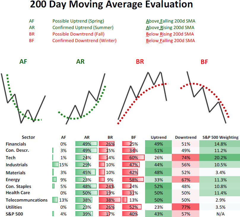
200 Day Moving Average Evaluation – Long Term Trend Determination
As shown in the table below, the net percentage of stocks that are in long term uptrends fell to 43%. In terms of sectors, the ones showing the worst market breadth are utilities (23%), technology (26%), and energy (33%).
Moving Average Trend Analysis (MATA) – Intermediate Term Trend Determination
The MATA survey for the S&P 500 has weakened in the last few weeks from 72% to 32% which caused the S&P 500’s intermediate outlook to be downgraded from neutral-bearish to outright bearish. Of the ten sectors in the S&P 500, the industrial and materials sectors are showing the best strength while the utility sector is deeply oversold with only 10% of its members in bullish intermediate trends.
52-Week Highs and Lows Data
The data for the 52-week highs and lows for the S&P 500 is a bit confusing and mirrors the data we see in the MATA survey. The market is currently undergoing a correction with some calling for a bear market. As a bull market transitions into a bear market you typically see the most economically sensitive sectors peak first and enter their own private bear markets with defensive sectors peaking last. We are seeing the complete opposite of this as two of the top three sectors with the most members that saw 52-week highs in the last trading week are economically sensitive and tied to global growth. The top sector is the materials sector followed by health care and industrials.
What’s even more interesting is that the two worst sectors with the most members putting in 52-week lows are defensive in nature. The utility sector takes the top spot with more than 16% of its members hitting 52-week lows followed by the telecommunication sector at 12.50%.
Just looking at the 52-week high data broken out by sector wouldn’t suggest the fingerprints of a major market top forming, but rather just a correction in an ongoing bull market.
Sector & Asset Class Rotation
Below is the relative rotation graph from Bloomberg that shows both the relative momentum and relative performance of assets versus a benchmark. Numbers north of 100 show improving relative momentum while numbers below show weakening relative momentum to the benchmark, and numbers to the right of 100 show outperforming assets and to the left underperforming assets.
Market Cap Rotation
Over the last few weeks we have seen small caps (SML) lose their momentum they had a month ago while megacap stocks (OEX) continue to weaken. The midcap space (MID) appears to be holding up the best in this decline as their momentum has not weakened and is slightly strengthening even further. The sharp declining momentum in small caps highlights investors unwillingness to hold risky assets and a move to perceived safety.
Weekly Market Cap Relative Performance to S&P 500 (11/15/2012)
Source: Bloomberg
Sector Rotation
This move to safety is also being displayed in sector relative performance and momentum as the utility (XLU) and consumer staples (XLP) sectors have shown the greatest improvement over the last few weeks while the energy (XLE) and technology sector (XLK) have deteriorated the most.
Weekly Sector Relative Performance to S&P 500 (11/15/2012)
Source: Bloomberg
Fixed Income Rotation
The message of shying away from risk assets is also present in the fixed income market. Over the last quarter the emerging bond market (EMB) is losing bullish relative momentum to the UST market (TLT), with investment grade corporates (LQD), high yield (HYG), and preferreds (PFF) also weakening considerably relative to the UST market.
Weekly Fixed Income Relative Performance to iShares Barclays 20+ Year T-Bond (11/15/2012)
Source: Bloomberg
Summary
The market’s long-term and intermediate-term trend have both weakened with the intermediate outlook now outright bearish (<40% reading) while the market’s longer-term outlook is on the verge of moving from neutral-bearish to outright bearish. While we are experiencing a sharp correction and the intermediate and long term outlook for the US stock market has worsened, this may end up only being a nasty correction in an ongoing bull market as were the 2010, 2011 and 2012 summer corrections. Right now one of the major fingerprints of a top (cyclicals performing worst) isn’t present with industrials and materials showing the best performance and breadth.


